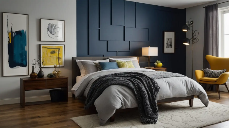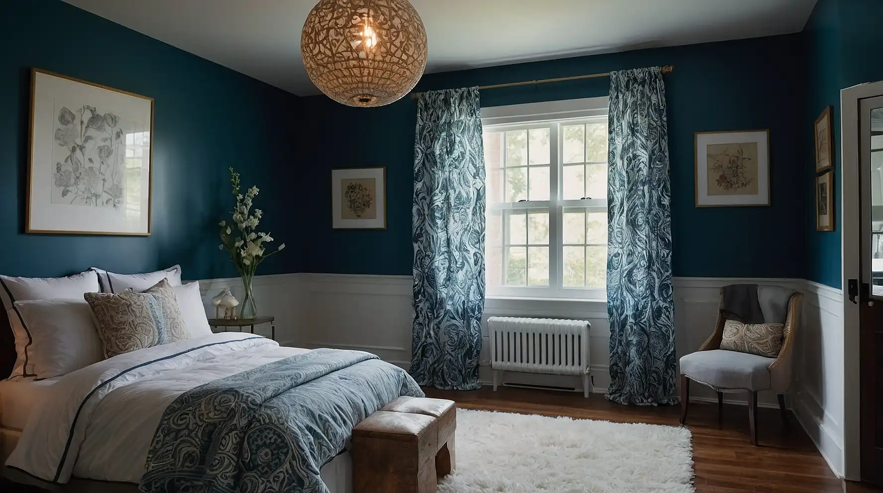
27 Best Paint Colors for Low Light Rooms That Will Brighten Your Space
Dark, dim spaces pose a unique decorating challenge.
The right paint color can transform a gloomy room into a bright, inviting space that feels larger and more welcoming—no renovation required.
Choosing colors for low light environments requires understanding how light interacts with pigment.
While your instinct might be to go bright white, several unexpected shades actually perform better in minimal light.
Ready to banish the darkness?
These 27 paint colors will help you maximize light in north-facing rooms, basements, hallways, and other challenging spaces in your home.
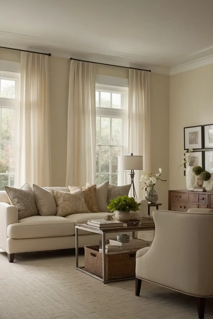
1: Pale Buttercream
Pale buttercream infuses your low light room with subtle warmth that mimics sunlight.
This soft yellow-white reflects available light while counteracting the cool shadows typical in dim spaces.
Unlike stark whites that can appear dull or gray in poor lighting, buttercream maintains its gentle warmth even in the darkest conditions.
It pairs beautifully with both cool and warm accent colors.
For maximum effect, choose a buttercream with a light reflectance value (LRV) above 80, ensuring it will bounce as much light as possible around your space.
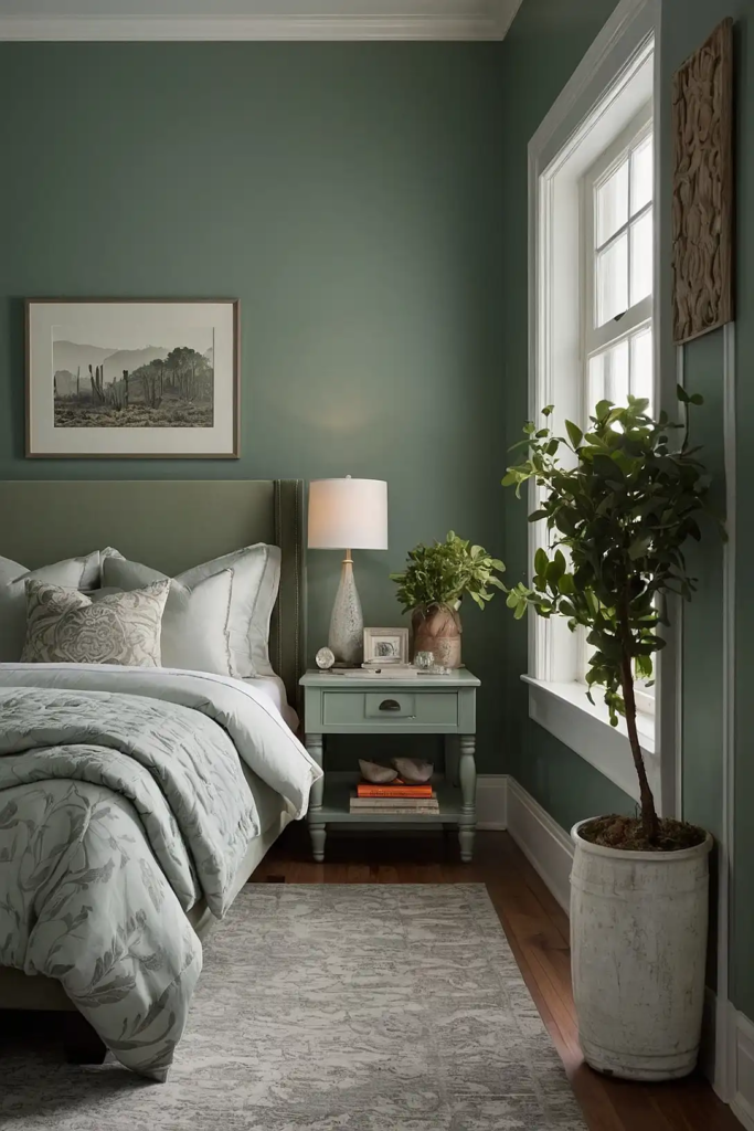
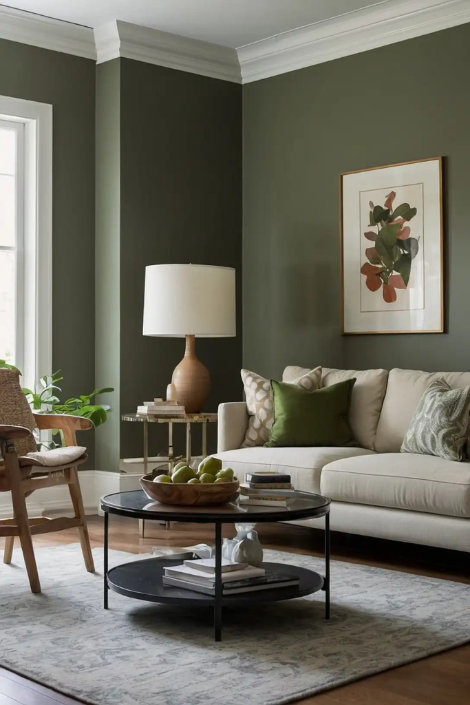
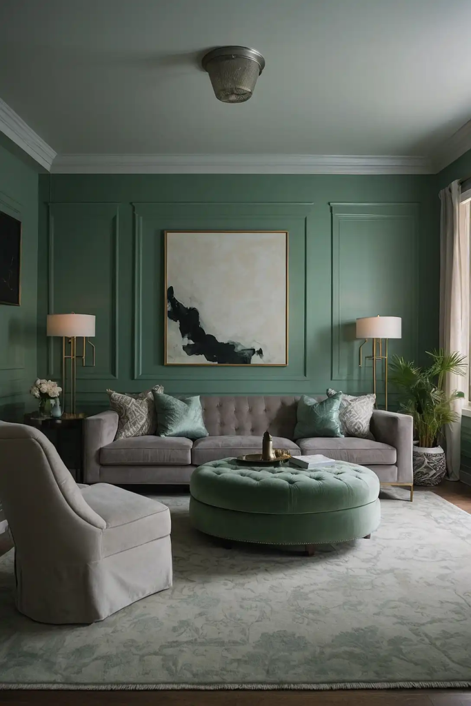
2: Soft Sage Green
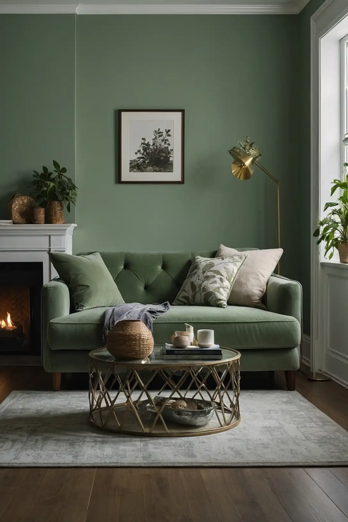
Soft sage green creates an organic, calming atmosphere in low light conditions.
This muted green with gray undertones retains its character even in dim spaces, unlike brighter greens that can turn muddy.
The subtle earthy quality provides warmth without heaviness, making your room feel more connected to nature despite limited natural light.
It pairs especially well with cream and natural wood tones.
Choose a sage with high LRV (65-75) and slight yellow undertones rather than blue to ensure it maintains a fresh rather than gloomy appearance.
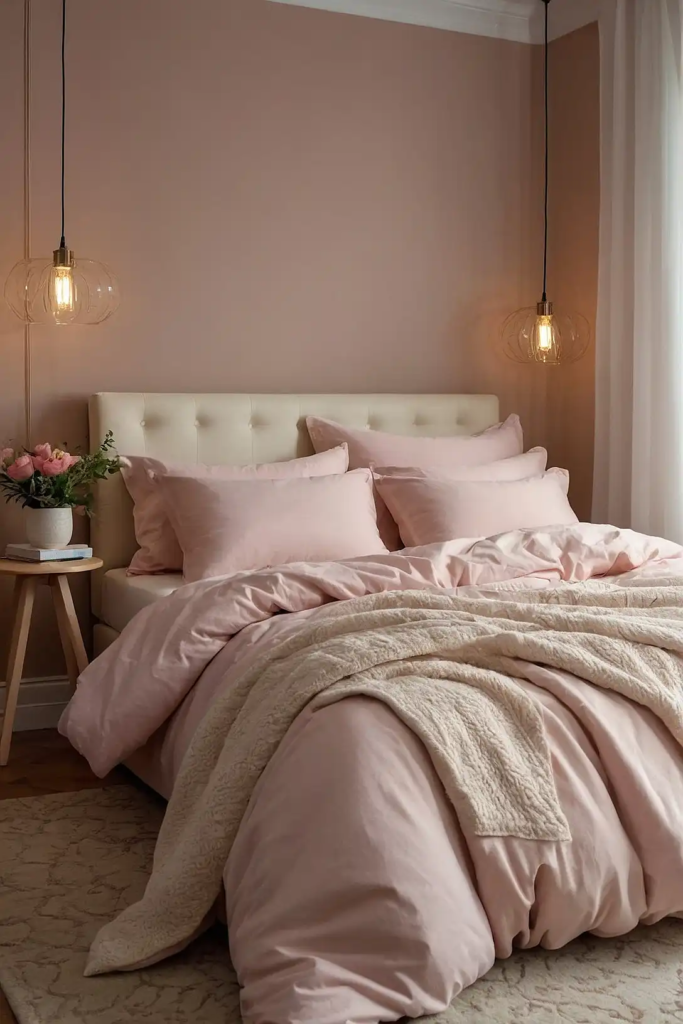
3: Blush Pink
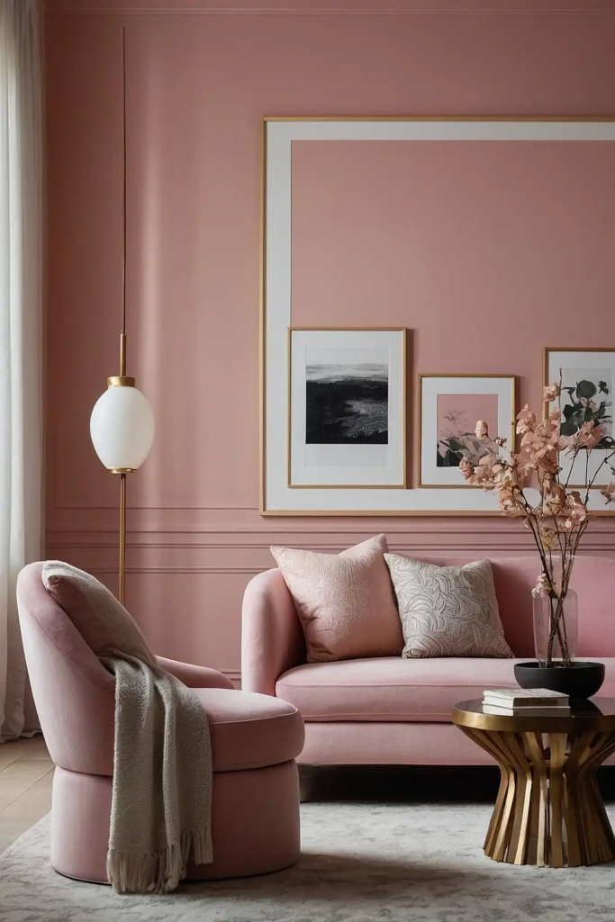
Blush pink adds a flattering glow to dark rooms, reflecting light in a way that creates a luminous effect.
This subtle pink acts as a neutral while adding dimension beyond basic white.
The warm undertones counteract the cool shadows in low light spaces, creating balance and depth.
Choose a blush with gray undertones for sophistication rather than sweetness.
This color works particularly well in bedrooms and powder rooms, where its flattering quality enhances both the space and its occupants in dim conditions.
4: Silver Sage
Silver sage combines the calming qualities of green with the reflective properties of silver-gray.
This sophisticated hybrid maintains its character in low light while brightening the space.
Unlike pure green, which can appear dull in dim conditions, the silvery component helps this color reflect whatever light is available.
It pairs beautifully with crisp white trim and natural textures.
This chameleon-like color shifts throughout the day, appearing more green in brighter moments and more silver in lower light for visual interest.
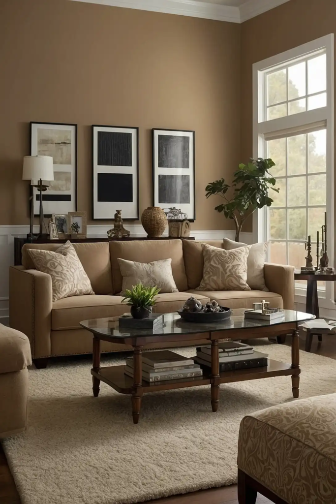
5: Warm Greige
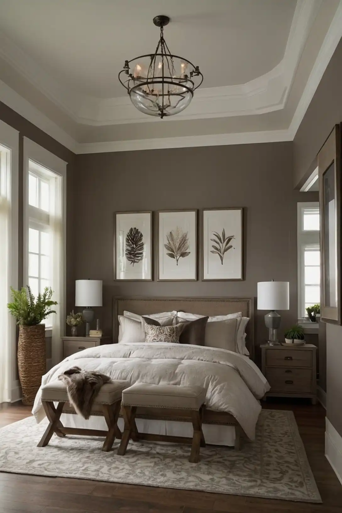
Warm greige—that perfect blend of gray and beige—creates a sophisticated neutral foundation that maintains warmth in low light settings.
Unlike pure gray, which often turns flat and dull, greige retains complexity.
The beige component prevents the shadowy, cave-like feeling that can happen with cooler colors in dim spaces.
Look for a greige with yellow rather than blue undertones.
This adaptable color works in any room and pairs with virtually any accent color, making it one of the most versatile options for challenging lighting situations.
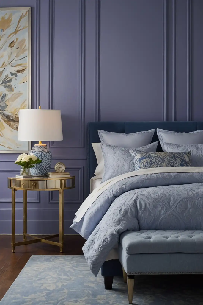
6: Pale Lavender
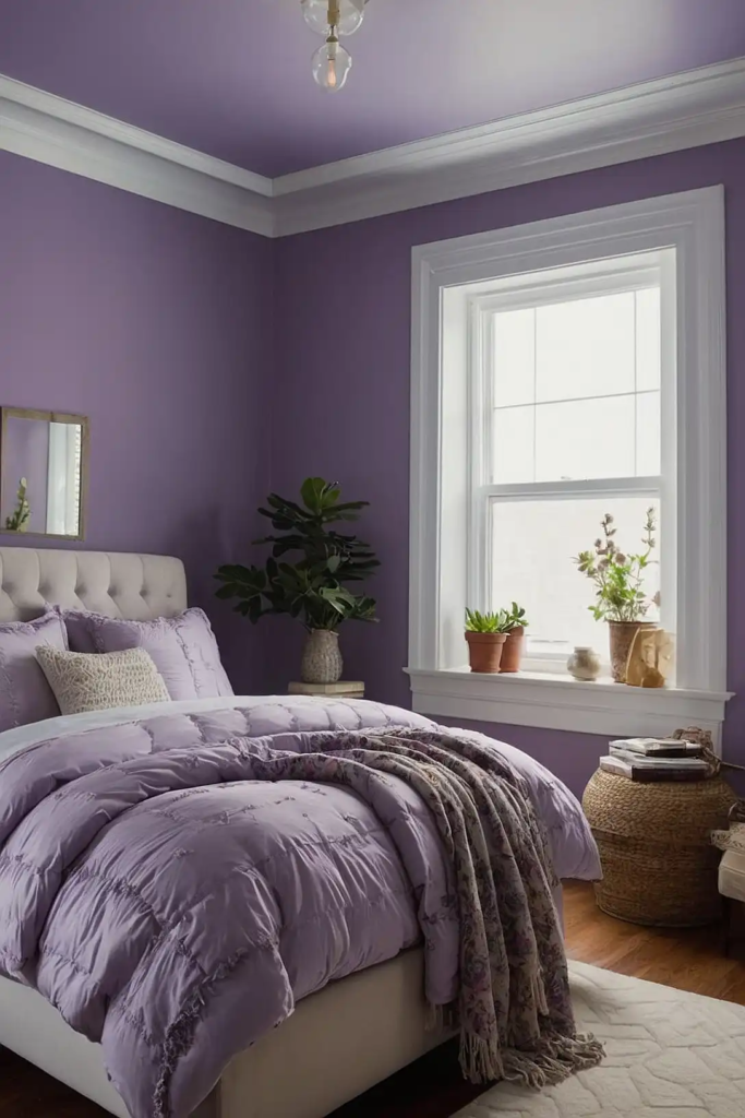
Pale lavender brings unexpected brightness to low light rooms.
This subtle purple-tinted neutral reflects light beautifully while adding interest beyond basic whites and creams.
Choose a very light lavender with gray undertones to avoid a childish feel—it should read as a sophisticated neutral with just a hint of color.
It pairs beautifully with whites, grays, and natural elements.
This color works particularly well in north-facing rooms, where its subtle warmth counteracts cool northern light without appearing too purple.
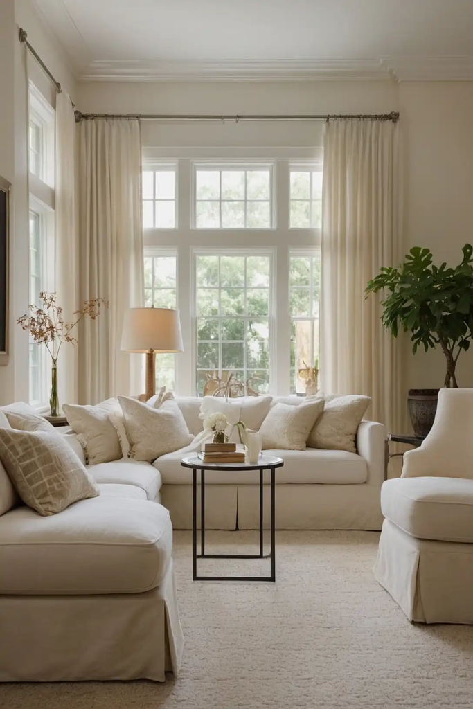
7: Creamy Ivory
Creamy ivory brings essential warmth to dim spaces while maintaining high light reflectance.
Unlike stark whites that turn dull and gray in low light, ivory maintains its rich warmth regardless of lighting conditions.
The subtle yellow undertones create a welcoming glow that mimics sunlight in spaces that receive little natural illumination.
It pairs beautifully with virtually any accent color.
For maximum effectiveness, choose an ivory with an LRV between 75-85, giving you excellent light reflection while maintaining that essential warmth.
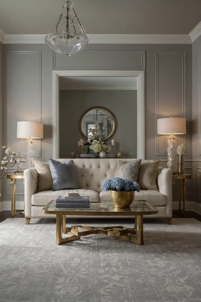
8: Light Pewter
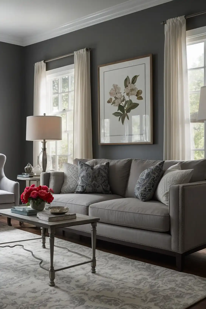
Light pewter creates brightness with sophisticated depth in poor lighting conditions.
This complex light gray with warm undertones reflects light beautifully while adding more interest than plain white.
Unlike cool grays that can appear dreary in dim spaces, light pewter maintains a subtle warmth that prevents that cave-like feeling.
It pairs well with both cool and warm accent colors.
This versatile neutral adapts to changing light throughout the day, shifting subtly from more beige to more gray for visual interest.
9: Pale Aqua
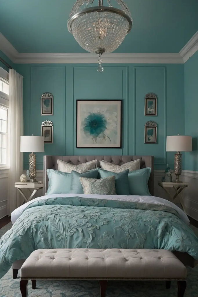
Pale aqua brings a hint of refreshing color while maintaining excellent light-reflecting properties.
This soft blue-green hybrid adds subtle energy to dim spaces without darkening them.
Choose a very light aqua with plenty of white—almost a tinted neutral—to ensure maximum brightness.
It pairs beautifully with crisp whites and natural wood tones.
This color works particularly well in basement spaces or bathrooms with limited natural light, where its water associations create a fresh, clean atmosphere.
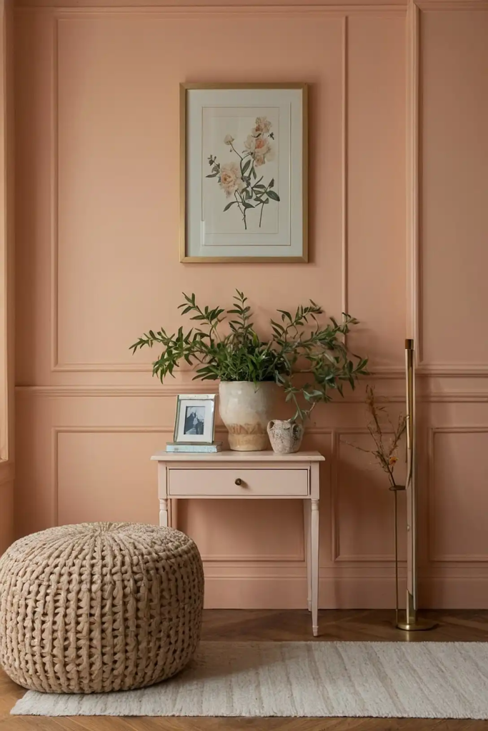
10: Soft Coral
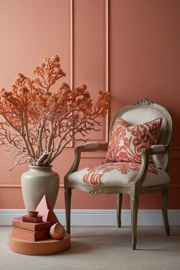
Soft coral adds energizing warmth to poorly lit spaces.
This muted orange-pink hybrid reflects light with a flattering glow that enhances everything in the room, including the people.
Unlike typical beiges, soft coral adds personality without sacrificing brightness.
Choose a muted version with plenty of white to ensure it remains light-enhancing rather than overpowering.
This color works particularly well in dining rooms with dim lighting, where its warm glow creates an inviting atmosphere and flatters skin tones beautifully.
11: Warm White
Warm white creates brightness without the cold, clinical feel that pure whites often produce in low light.
This subtle off-white with yellow undertones reflects maximum light while maintaining warmth.
Unlike stark whites that can appear dull gray in poor lighting, warm white maintains its character regardless of light conditions.
It pairs beautifully with any accent color.
Choose a warm white with an LRV above 85 and subtle creamy undertones to create a bright yet welcoming atmosphere in your challenging space.
12: Pale Wheat

Pale wheat brings natural warmth to dim spaces, reflecting light with a golden quality that mimics sunlight.
This subtle yellow-beige brightens rooms while adding more personality than basic neutrals.
The warm undertones counteract the cool shadows typical in low light environments, creating balance and warmth.
Choose a muted wheat with plenty of white for sophistication.
This versatile color works in any room but shines particularly in living spaces and hallways where its warm glow creates an inviting transition between areas.
13: Light Blue-Gray
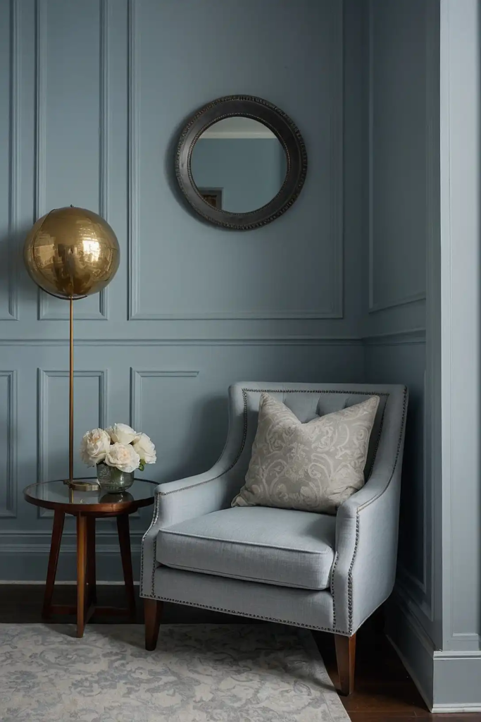
Light blue-gray brings airy brightness to challenging light situations.
This sophisticated hybrid adds subtle color while maintaining excellent light-reflecting properties for maximizing brightness.
Choose a blue-gray with warm undertones rather than cool to prevent a chilly feeling in already dim conditions.
It pairs beautifully with white trim and natural wood elements.
This versatile color adapts to changing light throughout the day, appearing more blue in brighter moments and more gray in lower light.
14: Pale Celery
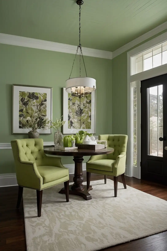
Pale celery adds refreshing brightness to dim spaces.
This light yellow-green brings subtle energy while reflecting light beautifully to maximize brightness in challenging conditions.
Unlike typical greens that can appear dull in low light, celery’s yellow undertones help maintain its character even in minimal illumination.
It pairs beautifully with crisp whites and natural textures.
This color creates a connection to nature even in interior rooms with no outdoor view, bringing organic freshness to otherwise dim spaces.
15: Cream with Pink Undertones
Cream with pink undertones creates luminous warmth in low light settings.
This sophisticated neutral reflects light with a subtle rosy glow that flatters everything in the room.
Unlike standard cream, the pink undertones add dimension that prevents the color from appearing flat or dull in poor lighting.
It pairs beautifully with both cool and warm accent colors.
This color works particularly well in bedrooms and powder rooms, where its flattering quality enhances both the space and its occupants regardless of lighting conditions.
16: Pale Khaki
Pale khaki brings natural warmth to challenging light situations.
This light beige with subtle green undertones reflects light beautifully while maintaining an earthy sophistication.
Unlike regular beige, which can appear flat in dim conditions, the green component adds complexity that holds up even in poor lighting.
It pairs especially well with crisp white and rich wood tones.
This versatile neutral works in any room and coordinates with most color schemes, making it a safe yet sophisticated choice for various spaces.
17: Light Oyster
Light oyster creates brightness with subtle depth in dim spaces.
This complex neutral with subtle pink-gray undertones reflects light beautifully while offering more character than basic white.
The warm undertones prevent the cool, shadowy feeling often experienced in poorly lit rooms.
Choose a light oyster with an LRV above 75 for maximum brightness.
This chameleon-like color shifts subtly throughout the day, creating visual interest even in spaces with minimal lighting variation.
18: Pale Apricot
Pale apricot brings a sunshine-like glow to challenging light situations.
This soft orange-tinted neutral reflects light with a warm quality that mimics natural illumination in dim spaces.
Unlike stark whites or cool colors that can feel flat in low light, apricot maintains its cheerful warmth regardless of lighting conditions.
Choose a very light, muted version for sophistication.
This color works particularly well in north-facing rooms where its warm undertones counteract cool northern light naturally and beautifully.
19: Icy Mint
Icy mint adds refreshing brightness to dim spaces.
This pale green with blue undertones reflects light beautifully while adding subtle energy to otherwise dark environments.
Choose a very light mint—almost a white with just a hint of color—to ensure it enhances rather than absorbs light.
It pairs wonderfully with crisp white trim and natural elements.
This color creates a fresh, clean feeling particularly welcome in basement spaces, bathrooms, or other areas that might otherwise feel stuffy or closed-in.
20: Soft Camel
Soft camel brings rich warmth to low light rooms without darkening them.
This light tan with yellow undertones reflects available light while adding more character than basic neutrals.
Unlike darker beiges that can feel heavy, soft camel maintains lightness while providing warmth that counteracts the cool shadows in dim spaces.
It pairs beautifully with both white and wood tones.
This versatile neutral works in any room but particularly shines in living areas and hallways where its warm glow creates an inviting atmosphere.
21: Pale Periwinkle
Pale periwinkle brings unexpected brightness to challenging light situations.
This soft lavender-blue hybrid reflects light beautifully while adding subtle interest beyond basic neutrals.
Choose a very light periwinkle with plenty of white—just a hint of color—to ensure maximum brightness.
The subtle warmth of its purple undertones prevents it from feeling cold in dim conditions.
This color works particularly well in bedrooms and reading nooks, where its gentle color creates a tranquil atmosphere despite limited natural light.
22: Light Butter Yellow
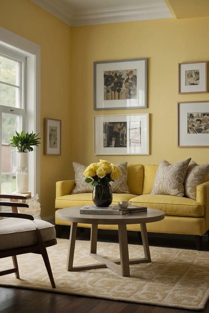
Light butter yellow creates sunshine-like brightness in dim spaces.
This soft, warm yellow reflects light with a cheerful glow that transforms dark rooms into welcoming environments.
Unlike bright yellows that can appear garish, light butter yellow provides subtle warmth that mimics natural light.
Choose a version with plenty of white for a sophisticated rather than childish feel.
This color works especially well in kitchens, dining areas, and north-facing rooms where its warm glow counteracts cool shadows naturally.
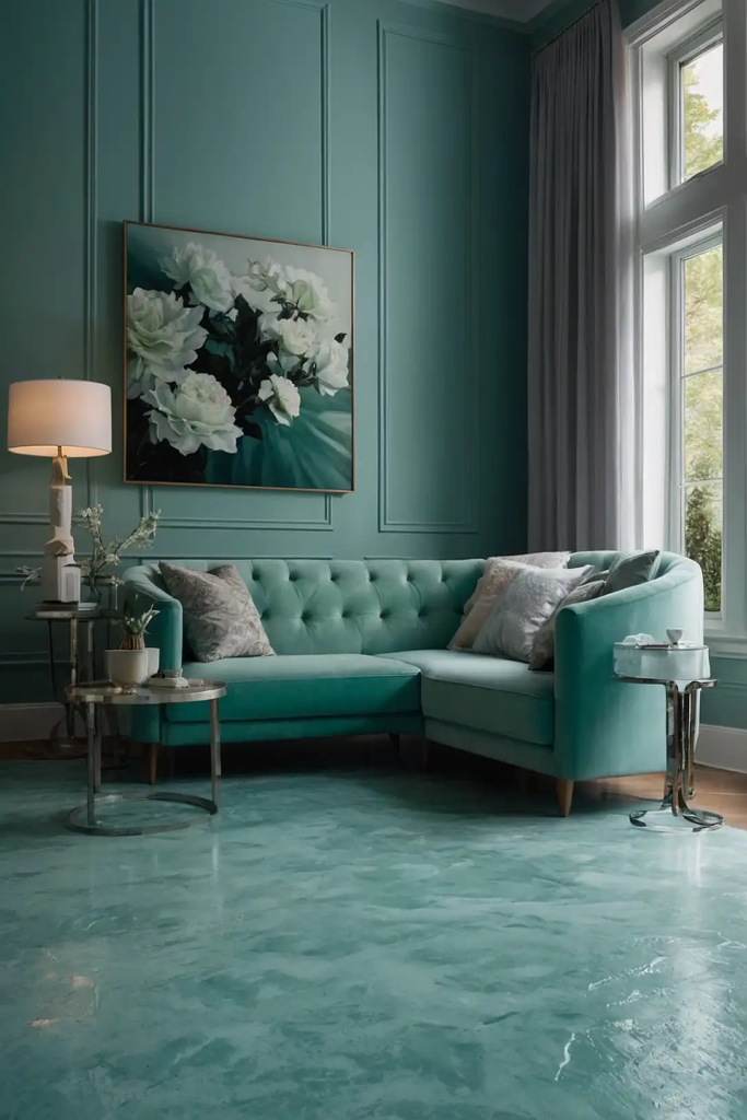
23: Silver Blue
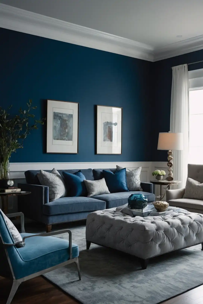
Silver blue brings reflective brightness to challenging light situations.
This sophisticated light blue with gray undertones maintains its character in dim conditions while maximizing light reflection.
The silvery component helps this color bounce light around your space, while the blue adds subtle color that prevents it from feeling flat.
It pairs beautifully with white trim and natural elements.
This versatile color works in any room but particularly shines in bedrooms and bathrooms, where its water associations create a tranquil, spa-like atmosphere.
24: Pale Linen
Pale linen creates natural warmth in low light settings.
This complex neutral with subtle yellow-gray undertones reflects light beautifully while offering more character than basic white.
Unlike stark whites that can appear dull in dim conditions, linen maintains its subtle texture and warmth regardless of lighting.
It pairs with virtually any accent color or wood tone.
This versatile neutral works in any room and adapts to both traditional and contemporary design schemes, making it an exceptionally safe choice for challenging spaces.
25: Light Peach
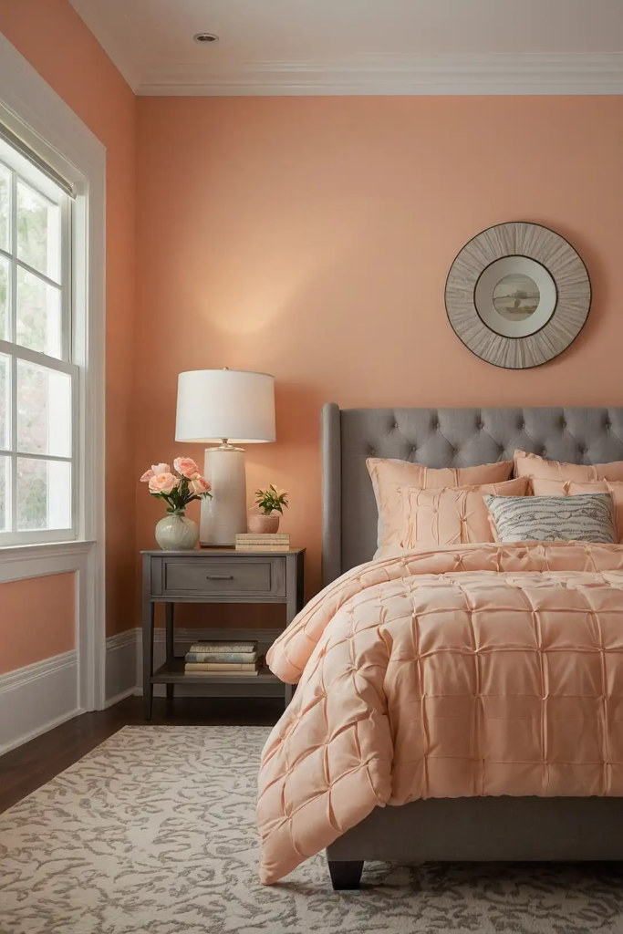
Light peach brings a flattering glow to dim spaces.
This soft orange-pink neutral reflects light with a warm quality that enhances everything in the room, including the people.
Choose a very subtle peach—almost a warm white with just a hint of color—to ensure sophisticated brightness rather than obvious color.
It pairs beautifully with both cool and warm accent tones.
This color works particularly well in dining rooms, living rooms, and bedrooms where its flattering glow creates an inviting atmosphere regardless of lighting conditions.
26: Pale Silver Green
Pale silver green creates luminous brightness with subtle natural associations.
This sophisticated hybrid combines the reflective qualities of silver with the fresh energy of light green.
The high reflectance value helps maximize whatever light is available, while the green component adds interest beyond basic neutrals.
It pairs beautifully with white trim and natural wood tones.
This versatile color works in any room but particularly shines in transitional spaces like hallways, where its light-enhancing properties brighten otherwise challenging areas.
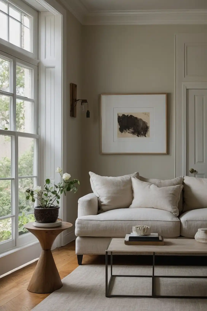
27: Cloud White
Cloud white offers maximum brightness with subtle depth in low light settings.
Unlike stark whites that appear flat or gray in dim conditions, cloud white maintains a gentle warmth that feels natural.
The subtle creamy undertones prevent that clinical feeling while reflecting light beautifully throughout your space.
It pairs with absolutely any accent color or design style.
Choose a cloud white with an LRV of 85+ to ensure maximum light reflection while maintaining that essential hint of warmth that makes spaces feel inviting rather than sterile.
Conclusion
The right paint color transforms your dim space from dreary to bright and welcoming.
Whether you choose subtle neutrals or light color-infused options, these 27 shades will help you maximize light and create rooms you’ll love to live in.