27 Best Interior Paint Colors to Transform Your Home in 2025
Choosing the perfect paint color can completely transform your living space from ordinary to extraordinary with minimal investment.
The right shade creates mood, affects perceived room size, and showcases your personal style in ways few other design elements can match.
Whether you prefer timeless neutrals or bold statements, these carefully curated paint colors will help you create spaces that feel both current and uniquely yours.
1: Swiss Coffee (Benjamin Moore)
This creamy off-white creates a warm, inviting backdrop that flatters almost any décor style.
Unlike stark whites, Swiss Coffee adds subtle depth without feeling yellowed or dated.
The gentle warmth makes it ideal for north-facing rooms that need brightening.
This versatile neutral works beautifully in both traditional and contemporary spaces, adapting to your existing furnishings.
Pair with dark hardware and wood tones for pleasing contrast that keeps spaces from feeling flat or washed out.
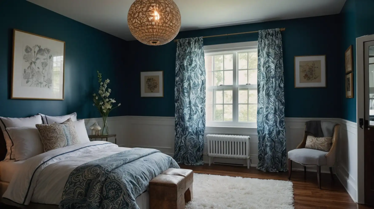
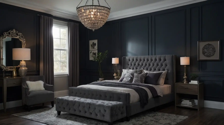
2: Hale Navy (Benjamin Moore)
This deep, sophisticated navy adds dramatic impact while remaining surprisingly versatile.
The perfect balance of blue and black undertones keeps it from feeling too bright or primary.
Use in dining rooms for evening elegance or home offices for focused concentration.
The timeless maritime associations create instant architectural interest even in builder-grade spaces.
This shade pairs beautifully with brass fixtures, creating a classic look that never feels trendy or temporary.
3: Agreeable Gray (Sherwin-Williams)
This perfect “greige” hybrid combines the best qualities of gray and beige for a thoroughly modern neutral.
The chameleon-like quality adapts to different lighting conditions throughout the day.
This versatile foundation coordinates effortlessly with virtually any accent color.
The subtle warmth prevents the coolness that makes some grays feel sterile or institutional.
Consider this your foolproof choice for open-concept spaces where color transitions can prove challenging.
4: Chantilly Lace (Benjamin Moore)
This crisp, clean white delivers brightness without the blue undertones that can make rooms feel cold.
The perfect balance creates a gallery-like backdrop for artwork and furnishings.
The refreshing quality makes spaces feel instantly larger and airier.
This sophisticated choice works particularly well in contemporary spaces with architectural interest.
Pair with contrasting black accents for dramatic modern contrast or wood tones for softer, Scandinavian-inspired spaces.
5: Aegean Teal (Benjamin Moore)
This soothing blue-green creates a contemplative atmosphere perfect for bedrooms and reading nooks.
The perfect balance between blue and green keeps it sophisticated rather than juvenile.
The subtle gray undertones add depth and prevent the color from overwhelming a space.
This versatile mid-tone works equally well as an accent wall or whole-room color.
Consider this shade for spaces where you want to create a sense of calm and connection to nature.
6: Revere Pewter (Benjamin Moore)
This warm gray creates a sophisticated neutral backdrop that adapts beautifully to changing light.
The perfect balance of warm and cool undertones makes it extraordinarily versatile.
This crowd-pleasing neutral works in virtually any room, from living spaces to bedrooms.
The depth provides more interest than basic beige without the commitment of stronger colors.
Pair with white trim for a clean, tailored look that enhances architectural details throughout your home.
7: Pale Oak (Benjamin Moore)
This soft, sophisticated neutral creates a gentle warmth without leaning too pink or yellow.
The subtle depth flatters skin tones and furnishings alike, making it perfect for gathering spaces.
The versatile undertones coordinate beautifully with both warm and cool accent colors.
This elegant choice provides more character than white while maintaining an open, airy feeling.
Consider this shade for rooms where you entertain frequently or where natural light changes dramatically throughout the day.
8: Urbane Bronze (Sherwin-Williams)
This rich, earthy shade creates dramatic sophistication in dens, dining rooms, and powder rooms.
The perfect balance between gray and brown undertones keeps it from feeling dated or heavy.
Use as an accent wall to create instant architectural interest without renovating.
The grounding quality makes it ideal for spaces where you want to create intimacy and warmth.
This versatile dark neutral pairs beautifully with natural elements like wood, leather, and stone.
9: Sea Salt (Sherwin-Williams)
This ethereal blue-green-gray creates a spa-like tranquility in bathrooms, bedrooms, and sunrooms.
The chameleon-like quality shifts subtly throughout the day, keeping spaces interesting.
The natural associations make it perfect for creating a connection to outdoor environments.
This versatile shade works beautifully with both coastal and farmhouse decorating styles.
Consider this color for spaces where you want to create a sense of relaxation and retreat from busy life.
10: Repose Gray (Sherwin-Williams)
This versatile light gray creates a sophisticated backdrop that works with virtually any decorating style.
The subtle warmth prevents the coolness that can make some grays feel unwelcoming.
This chameleon-like neutral adapts beautifully to different lighting conditions.
The depth provides more interest than white while maintaining an open, expansive feeling in smaller spaces.
Pair with bright white trim to enhance architectural details throughout your home.
11: Gentleman’s Gray (Benjamin Moore)
Despite its name, this sophisticated color presents as a deep, mysterious blue-black with tremendous depth.
The complex undertones create different effects as lighting changes throughout the day.
Use in dining rooms for evening drama or home libraries for old-world sophistication.
This statement color creates instant architectural interest even in basic, builder-grade rooms.
Pair with metallics like silver or gold for a luxurious combination that feels both timeless and current.
12: Edge-comb Gray (Benjamin Moore)
This perfect “greige” creates a sophisticated neutral that bridges the gap between gray and beige.
The chameleon-like quality makes it ideal for open floor plans where color must flow seamlessly.
The subtle warmth prevents the stark feeling that makes some neutrals feel unwelcoming.
This versatile choice coordinates effortlessly with virtually any accent color or wood tone.
Consider this shade for spaces where you want color without commitment, as it creates a perfect backdrop for ever-changing décor.
13: Coral Clay (Sherwin-Williams)
This warm, earthy coral adds personality without overwhelming your space.
The perfect balance of pink and orange undertones keeps it sophisticated rather than saccharine.
The energizing quality makes it ideal for gathering spaces like dining rooms or living areas.
This on-trend shade works surprisingly well as a whole-room color, not just as an accent.
Pair with natural wood tones and creamy whites for a combination that feels both current and timeless.
14: Newburyport Blue (Benjamin Moore)
This historical blue creates traditional elegance with modern versatility. The perfect balance of saturation provides impact without overwhelming your space.
Use in dining rooms for formal sophistication or bedrooms for serene retreat-like atmospheres.
The timeless quality makes it a safe investment that won’t quickly feel dated.
Consider this shade for spaces where you want to create a sense of tradition and permanence.
15: Simply White (Benjamin Moore)
This versatile white provides brightness without stark coldness or yellow undertones.
The perfect balance creates a clean, fresh backdrop for any decorating style.
The crisp quality makes spaces feel instantly larger and more welcoming.
This sophisticated choice enhances architectural details while letting your furnishings take center stage.
Pair with any accent color for a combination that feels intentional and designed rather than accidental.
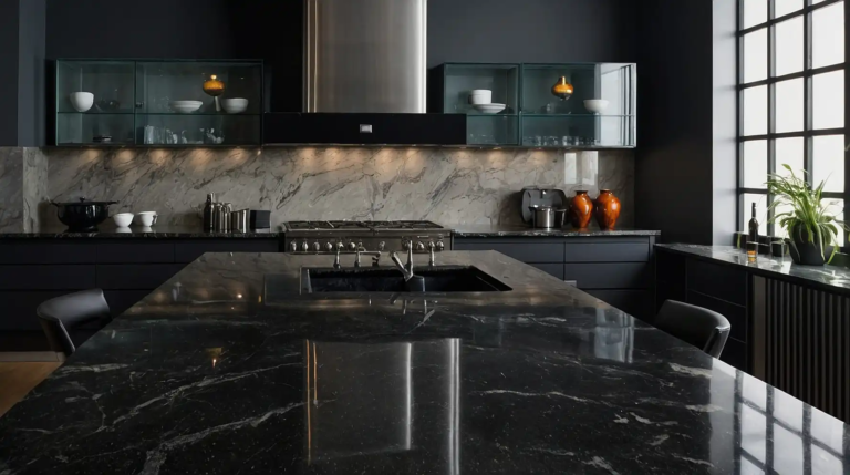
16: Tricorn Black (Sherwin-Williams)
This true black creates dramatic impact in powder rooms, dining areas, and accent walls.
The pure tone reads as genuinely black without unwanted blue or brown undertones.
Use strategically to highlight architectural features or create focal points.
This dramatic choice works surprisingly well in small spaces, creating jewel-box intimacy rather than heaviness.
Pair with bright whites for classic contrast or metallics for contemporary sophistication.
17: Palladian Blue (Benjamin Moore)
This soothing blue-green creates a spa-like tranquility in bathrooms, bedrooms, and sunlit spaces.
The perfect balance between blue and green keeps it sophisticated rather than childlike.
The subtle gray undertones add depth and prevent the color from feeling too bright or primary.
This versatile mid-tone changes beautifully throughout the day as natural light shifts.
Consider this shade for spaces where you want to create a sense of calm and connection to water elements.
18: Urbane Bronze (Sherwin-Williams)
This rich, earthy shade creates dramatic sophistication in dens, dining rooms, and powder rooms.
The perfect balance between gray and brown undertones keeps it from feeling dated or heavy.
Use as an accent wall to create instant architectural interest without renovating.
The grounding quality makes it ideal for spaces where you want to create intimacy and warmth.
This versatile dark neutral pairs beautifully with natural elements like wood, leather, and stone.
19: Pale Oak (Benjamin Moore)
This soft, sophisticated neutral creates a gentle warmth without leaning too pink or yellow.
The subtle depth flatters skin tones and furnishings alike, making it perfect for gathering spaces.
The versatile undertones coordinate beautifully with both warm and cool accent colors.
This elegant choice provides more character than white while maintaining an open, airy feeling.
Consider this shade for rooms where you entertain frequently or where natural light changes dramatically throughout the day.
20: Crushed Ice (Sherwin-Williams)
This luminous pale gray creates bright, open spaces without the starkness of pure white.
The subtle cool undertones provide sophistication without feeling cold or institutional.
The reflective quality maximizes natural light in darker spaces.
This versatile neutral works beautifully in both modern and traditional settings, adapting to your existing furnishings.
Pair with deeper accent colors to create pleasing contrast that highlights architectural features.
21: Kendall Charcoal (Benjamin Moore)
This rich, deep gray creates architectural interest and drama without the heaviness of black.
The perfect balance of warm and cool undertones keeps it sophisticated and versatile.
Use on kitchen islands to create a tuxedo effect against lighter cabinets.
This statement shade works beautifully on interior doors for unexpected sophistication throughout your home.
Consider this color for spaces where you want to create a sense of groundedness and permanence.
22: Balboa Mist (Benjamin Moore)
This ethereal light gray creates serene sophistication without feeling cold or sterile.
The perfect balance of warm and cool undertones makes it extraordinarily versatile.
This crowd-pleasing neutral works in virtually any room, from living spaces to bedrooms.
The subtle depth provides more interest than basic white without the commitment of stronger colors.
Pair with crisp white trim and warm wood tones for a combination that feels both current and timeless.
23: Peacock Blue (Benjamin Moore)
This vibrant, jewel-toned teal creates dramatic impact in dining rooms, powder rooms, and accent walls.
The perfect saturation level provides energy without overwhelming your space.
Use strategically to create focal points or highlight architectural features. This statement color pairs beautifully with both gold and silver metallic accents.
Consider this shade for spaces where you want to inject personality and create memorable impressions.
24: Creamy (Sherwin-Williams)
This warm off-white creates a cozy, inviting atmosphere without the yellowed look of some cream colors.
The subtle warmth makes it ideal for north-facing rooms that need brightening.
This versatile neutral works beautifully in both traditional and farmhouse-inspired spaces.
The depth provides more interest than stark white while maintaining an open, airy feeling.
Pair with deeper neutrals for a sophisticated monochromatic scheme that feels intentionally designed rather than accidental.
25: Slate Tile (Sherwin-Williams)
This complex blue-gray creates moody sophistication in bedrooms, dining rooms, and studies.
The perfect balance of blue and gray undertones keeps it from feeling too cold or impersonal.
The depth changes beautifully throughout the day as natural light shifts. This versatile mid-tone works equally well as an accent wall or whole-room color.
Consider this shade for spaces where you want to create a sense of contemplative elegance.
26: Ballet White (Benjamin Moore)
This soft, sophisticated neutral creates gentle warmth without leaning too yellow or pink.
The chameleon-like quality adapts beautifully to different lighting conditions throughout the day.
This versatile foundation coordinates effortlessly with virtually any accent color.
The subtle depth prevents the starkness that can make some whites feel clinical or unwelcoming.
Pair with natural textures like jute, linen, and wood for an organic, layered look with timeless appeal.
27: Colonnade Gray (Sherwin-Williams)
This perfect medium gray creates sophisticated neutrality without feeling too cool or industrial.
The subtle warmth makes it ideal for open floor plans where color flows between spaces.
This versatile choice works beautifully in both contemporary and traditional settings.
The depth provides character without overwhelming your existing furnishings and artwork.
Consider this foolproof shade for spaces where you want color without commitment, as it creates a perfect backdrop for ever-changing décor.
Conclusion
Choose colors that complement your lifestyle, enhance your existing furnishings, and create the mood you desire.
Don’t fear testing samples—the perfect shade varies dramatically with your unique lighting conditions.