35 Stunning Burnt Orange Living Room Ideas to Warm Up Your Space
Burnt orange brings immediate warmth and energy to living spaces, striking the perfect balance between sophisticated and inviting.
This versatile earth tone works with multiple design styles, from mid-century modern to boho chic and contemporary minimalism.
The rich, amber-inflected hue pairs beautifully with neutrals like cream and taupe while creating striking contrasts with blues and greens.
Its natural warmth makes it particularly appealing for creating cozy, conversation-friendly living rooms.
Ready to incorporate this trending color into your home?
Explore these 35 burnt orange living room ideas that range from subtle accents to bold statements, all designed to infuse your space with warmth and personality.
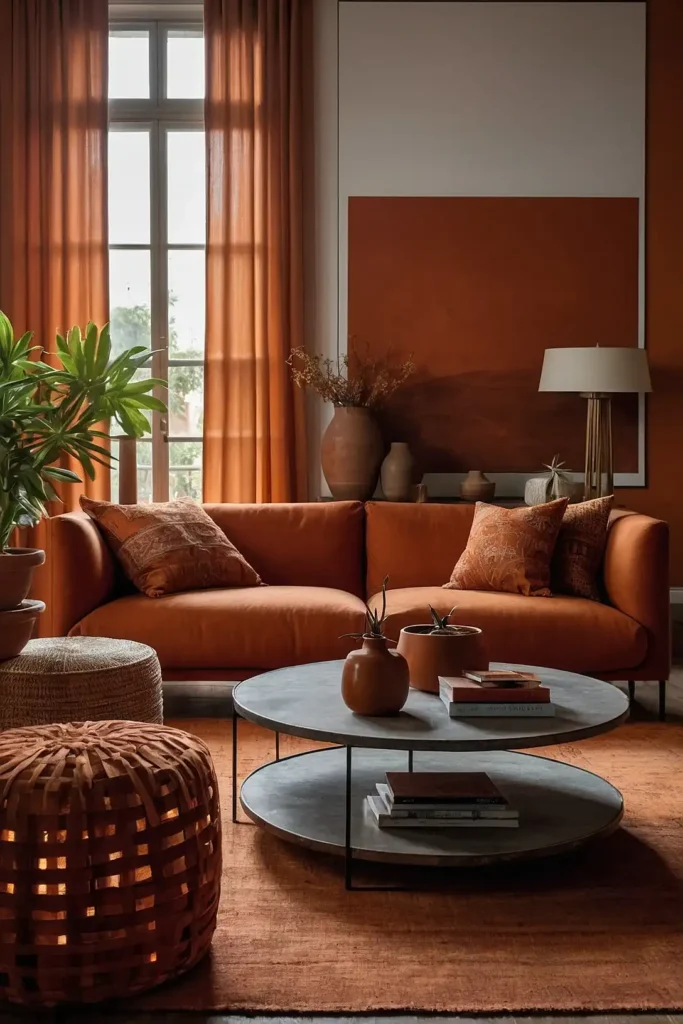
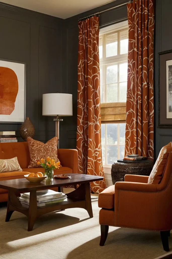
1: Statement Burnt Orange Sofa

Make a bold design choice with a burnt orange sofa as your living room’s focal point.
This investment piece instantly warms the space while providing a strong foundation for your color scheme.
Balance the vibrant seating with neutral walls and natural materials. The warm undertones complement wood elements beautifully, creating a cohesive look.
Add textural variety with different fabric types—velvet for luxury, linen for casual elegance, or leather for timeless sophistication.
2: Burnt Orange Accent Wall

Transform your living room with a single burnt orange accent wall that creates immediate visual impact.
This affordable update requires just a few gallons of paint but completely changes your space’s energy.
Position the accent wall behind your main seating area to frame your furniture arrangement.
The warm backdrop makes everything placed against it appear more vibrant and intentional.
Consider textured paint techniques or color-blocking with complementary tones to add depth and sophistication to this statement surface.
3: Layered Terracotta Textiles
Introduce burnt orange through multiple textile layers for a rich, dimensional effect.
Combine throw pillows, blankets, curtains, and area rugs in varied shades of terracotta and burnt orange.
Mix patterns and textures while maintaining your color theme—think geometric prints alongside organic patterns and smooth weaves paired with nubby textures.
This low-commitment approach allows you to adjust the intensity of the color seasonally by adding or removing orange elements.
4: Burnt Orange and Navy Color Scheme

Create a sophisticated palette by pairing burnt orange with deep navy blue.
This classic color combination offers perfect balance—the coolness of blue offsetting the warmth of orange.
Use navy for larger elements like sofas or walls, then punctuate with burnt orange accessories for a controlled approach.
Or reverse the equation with orange as your dominant color and navy as the accent.
The contrast between these complementary colors creates a dynamic, energetic space that still feels grounded and cohesive.
5: Mid-Century Modern Orange Elements

Embrace burnt orange’s natural affinity for mid-century modern design.
The color featured prominently in 1950s and 60s interiors, making it perfect for this popular style revival.
Look for iconic furniture pieces with clean lines and organic curves in this warm hue.
Pair with walnut wood tones, brass accents, and geometric patterns for authentic mid-century appeal.
Complete the look with vintage-inspired lighting featuring orange elements in glass or ceramic bases.
6: Burnt Orange Artwork Display

Curate a gallery wall featuring artwork with burnt orange tones. This creates cohesive color integration without committing to permanent design changes.
Mix media types—paintings, prints, photography, and textiles—unified by your color scheme.
The varied burnt orange hues create visual interest while maintaining harmony.
Position your gallery in conversation areas where guests can appreciate the details while the collective impact enhances your overall design scheme.
7: Terracotta Tile Accents
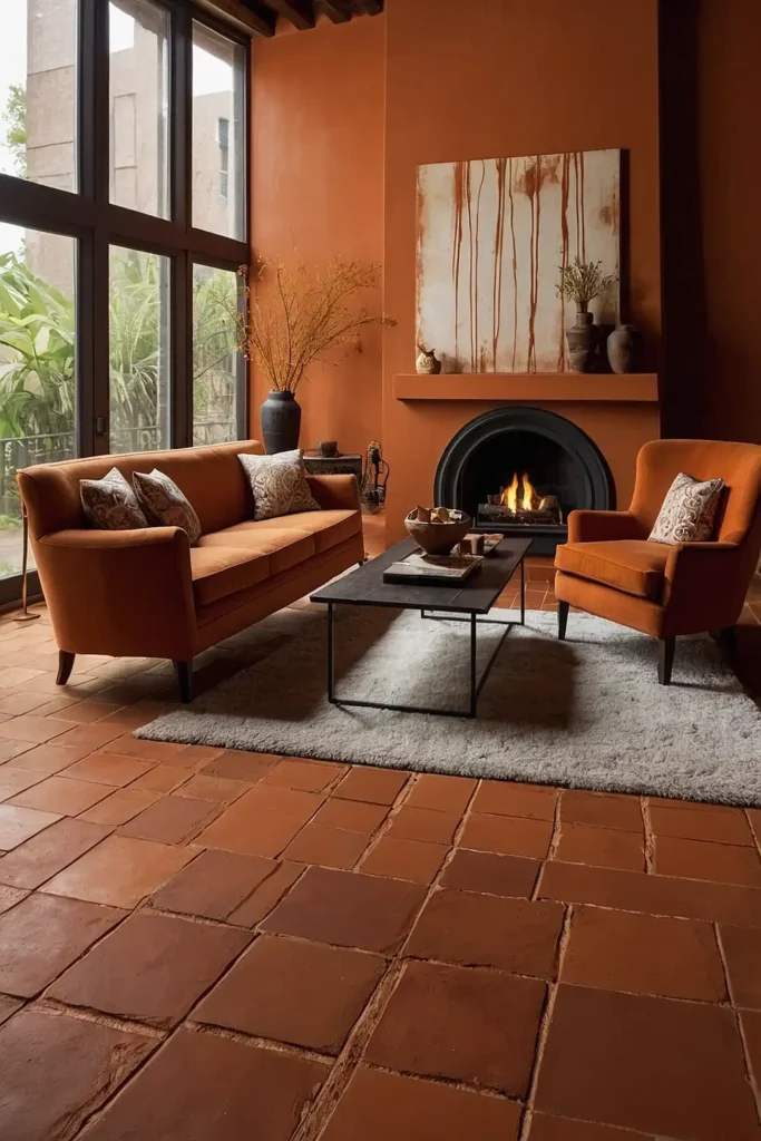
Incorporate burnt orange through terracotta tiles on fireplace surrounds, accent walls, or even coffee table tops.
These natural clay elements add both color and textural interest.
Choose between traditional terracotta with its organic variations or more consistent contemporary versions.
Both options bring warmth and earthy authenticity to your space.
The natural material connects your interior to the outdoors, creating grounding energy that makes spaces feel more relaxed and comfortable.
8: Sunset-Inspired Ombre Features

Create dramatic visual impact with Ombre effects that blend burnt orange with related hues like gold, amber, and deep red.
This sunset-inspired gradient adds sophisticated color depth.
Apply the technique to walls, drapery, or large textile art pieces. The color transition creates movement that draws the eye through your space.
The graduated color shifts prevent the orange from feeling flat or overwhelming, instead creating a dynamic, light-influenced atmosphere.
9: Burnt Orange Velvet Accent Chairs

Add luxurious seating with burnt orange velvet accent chairs. The rich fabric enhances the color’s depth while providing textural contrast to other furnishings.
Position chairs in conversation groupings or as standout pieces flanking a fireplace or window. Their presence creates natural focal points that anchor your design.
The combination of vibrant color and plush texture makes these pieces both visually and tactilely inviting, encouraging comfortable lingering.
10: Southwestern-Inspired Orange Patterns

Incorporate burnt orange through Southwestern-inspired patterns on rugs, throw pillows, and wall hangings.
These geometric designs bring cultural richness and visual interest to your space.
Pair with natural materials like leather, wood, and stone for authentic Southwestern appeal.
The earthy elements complement the warmth of burnt orange perfectly.
This design direction works especially well in spaces with architectural features like exposed beams or stucco walls that enhance the regional aesthetic.
11: Orange Ceramic Lamp Collection
Curate a collection of burnt orange ceramic table lamps to add color at eye level. These functional art pieces provide both ambient lighting and sculptural interest.
Vary the heights, shapes, and orange tones for collected-over-time appeal. Mix glossy and matte finishes to create textural contrast within your color scheme.
The warm glow through orange-tinted lampshades creates especially cozy evening ambiance that enhances the color’s natural warmth.
12: Burnt Orange Leather Ottoman

Center your seating arrangement around a burnt orange leather ottoman that serves multiple functions—coffee table, extra seating, and colorful anchor piece.
Choose genuine leather for a patina that improves with age or high-quality vegan leather for a more affordable option.
Both materials offer easy-care durability perfect for this high-use item.
The rich texture and warm color create an inviting centerpiece that naturally draws people together in conversation.
13: Rust and Cream Geometric Rug

Ground your space with a burnt orange and cream geometric rug that adds pattern and color from the floor up.
This foundation piece sets the tone for your entire color scheme.
Look for designs with varying pile heights or mixed materials to add textural interest.
The geometric pattern provides structured contrast to more organic furniture shapes.
This substantial color commitment actually functions as a neutral base when paired with complementary furniture and accessories.
14: Burnt Orange Bookshelf Backdrop

Paint the back walls of your bookshelves in burnt orange to create depth and showcase your collections.
This concentrated color application creates impact without overwhelming the space.
The vibrant backdrop makes books, photographs, and decorative objects pop visually.
White or light-colored shelving creates crisp definition against the warm background.
This contained approach to color provides architectural interest while maintaining a largely neutral room palette, perfect for color-cautious decorators.
15: Terracotta and Plant Combination
Pair burnt orange elements with abundant greenery for a nature-inspired color scheme.
The complementary colors create vibrant energy while referencing natural landscapes.
Use terracotta planters for a double dose of orange—both in the containers and the color itself.
The earthy material enhances the organic quality of your plant display.
This biophilic approach connects interior spaces with the outdoors, creating rooms that feel alive and harmoniously balanced.
16: Burnt Orange Kitchen View

Create color continuity by incorporating burnt orange in kitchen areas visible from your living room.
This design strategy expands the perceived space through color flow.
Consider orange counter stools, pendant lights, or even cabinet colors that complement your living room palette.
The coordinated colors create a cohesive open-concept feel.
This approach works particularly well in smaller homes where visual consistency helps spaces feel more expansive and intentionally designed.
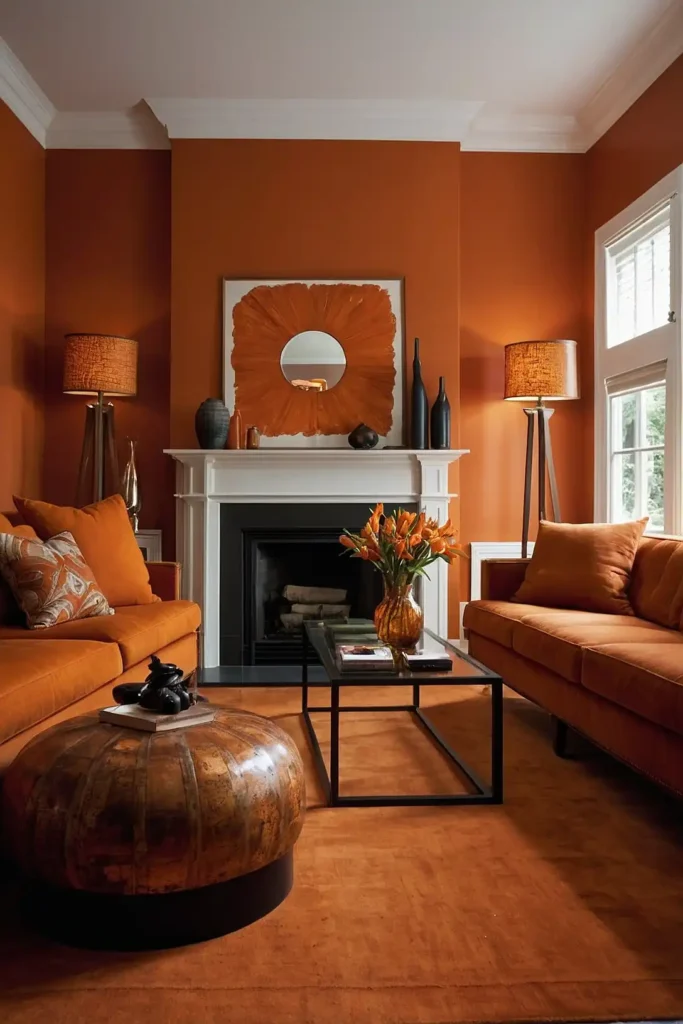
17: Autumnal Orange Fireplace Feature
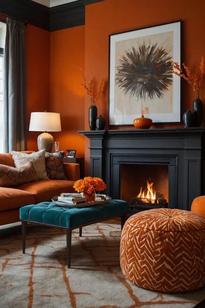
Make your fireplace a seasonal focal point with burnt orange accents that complement the warm tones of flames.
This color pairing creates a naturally cozy atmosphere.
Consider orange firebrick interiors, painted mantels, or surrounding tile work.
These permanent elements establish your color scheme while remaining architecturally appropriate.
Enhance the effect with coordinating accessories that can be adjusted seasonally—orange logs in a copper basket or amber glass vessels on the mantel.
18: Burnt Orange Woven Wall Hanging

Add texture and acoustic benefits with a large-scale woven wall hanging featuring burnt orange yarns.
This fiber art creates a striking focal point while softening your space acoustically.
Look for pieces with varied weaving techniques and mixed fibers for visual complexity.
The textural element adds depth that flat color applications can’t achieve.
These artisanal pieces bring handcrafted character to contemporary spaces, creating welcome contrast to manufactured furniture and finishes.
19: Orange-Toned Wood Elements

Incorporate burnt orange through wood elements with natural orange undertones.
Cherry, cedar, and some pine varieties feature warm hues that complement your color scheme.
Use these wood tones in furniture, flooring, ceiling beams, or architectural details.
The natural material brings organic warmth that enhances the cozy qualities of burnt orange.
This subtle approach integrates color through permanent elements that won’t feel trendy or temporary as your design evolves.
20: Moroccan-Inspired Orange Accents
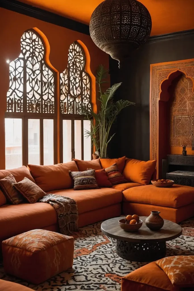
Create exotic atmosphere with Moroccan-inspired burnt orange elements.
Look for pierced metal lanterns, patterned textiles, and ornate furniture pieces featuring this warm hue.
Combine with complementary jewel tones like turquoise and emerald for authentic
Moroccan color play. The rich color combinations create vibrant, globally-influenced spaces.
Add metallic accents in gold and brass to enhance the luxurious feel while reflecting light that makes the orange tones appear even richer.
21: Burnt Orange Window Treatments
Frame your view with burnt orange drapery that filters light with a warm glow.
This significant color statement transforms both day and evening atmospheres in your living room.
Choose light-filtering fabrics that allow the orange to illuminate with sunlight. The colored light cast creates a magical ambiance that changes throughout the day.
Layer with neutral blinds or shades for light control flexibility while maintaining your color scheme through the outermost visible layer.
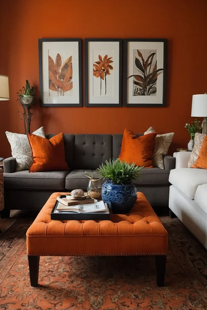
22: Gradient Color Blocking

Create architectural interest with color-blocked walls featuring burnt orange transitioning into complementary hues.
This contemporary technique adds sophisticated color play without patterns.
Try burnt orange alongside terracotta, deep amber, or even contrasting navy or teal for dramatic effect.
The crisp dividing lines add geometric appeal to simple walls.
This painting technique creates the impact of wallpaper with greater customization and typically lower cost, perfect for personalized color exploration.
23: Burnt Orange Media Wall

Designate your entertainment area with a burnt orange color treatment that frames your television and components.
This design choice turns technology into an intentional design feature.
The warm background makes black screens less dominant when not in use. Consider cabinetry or shelving in this hue to create a cohesive entertainment zone.
This strategic color placement draws attention to your gathering area while creating a natural focal point for furniture arrangement.
24: Orange and Brass Lighting Features

Install statement lighting with burnt orange glass or fabric shades paired with brass hardware.
This overhead color source creates ambient warmth beyond just the visible fixtures.
Look for pendant lights, chandeliers, or sconces that incorporate your signature hue. The illuminated color appears more vibrant, creating a glowing effect.
This elevated approach to color introduction adds sophistication while keeping orange at eye level and above, rather than weighing down the space.
25: Burnt Orange Built-In Cabinet Interiors

Display collections against burnt orange cabinet interiors for dramatic presentation of everyday objects.
This contained color application creates jewel-box moments throughout your living space.
Paint or wallpaper the inside back panels of shelving units while keeping exterior cabinet frames neutral. This creates stunning contrast that highlights your displays.
The framed color moments create rhythm throughout your space while maintaining clean, architectural lines in the overall room design.
26: Terracotta Floor Tiles

Install burnt orange terracotta floor tiles for a permanent foundation of warm color.
This traditional material brings authentic character and practical durability to living spaces.
Choose between traditional rustic tiles with variations in tone or contemporary interpretations with more consistent color.
Both options ground spaces with earthy warmth.
The natural thermal properties of terracotta create comfortable living environments while its color creates a perpetually sunset-lit atmosphere.
27: Minimalist Orange Color Blocking

Embrace burnt orange through clean-lined color blocking that respects minimalist principles.
This contemporary approach introduces color without busy patterns or excessive details.
Create geometric compositions with painted walls sections, large-scale art, or architectural dividers.
The crisp delineation keeps the color application feeling modern and intentional.
This controlled use of vibrant color works particularly well in spaces with architectural interest and limited decorative elements.
28: Copper Metal Accents

Incorporate burnt orange tones through copper decorative elements.
This metallic version of the color adds luminosity and reflective qualities to your orange color story.
Look for copper light fixtures, tables, decorative bowls, or picture frames. The material’s natural patina process adds character that evolves over time.
Mix polished and weathered copper finishes for textural contrast while maintaining color cohesion in your carefully curated metallic elements.
29: Orange Upholstered Headboard View
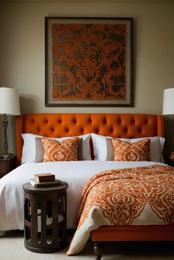
Create bedroom-living room continuity with a burnt orange upholstered headboard visible from your living space.
This color connection creates flow in open-concept homes.
Position furniture to frame this view, using it as an intentional design element. The glimpse of continuing color creates depth and draws the eye through your space.
This technique works particularly well in smaller homes or apartments where room-to-room color cohesion creates more expansive perceived space.
30: Ombre Painted Furniture
Transform basic furniture with Ombre painting techniques that transition from burnt orange to complementary hues.
This customized approach creates one-of-a-kind pieces.
Apply to dressers, side tables, or console cabinets visible in your living area. The gradient effect adds artistic flair to functional pieces.
This DIY-friendly technique allows for personalized color combinations while creating high-impact furniture that serves as functional art in your space.
31: Burnt Orange Ceiling Treatment

Paint your ceiling in burnt orange for unexpected color that doesn’t overwhelm your daily sight lines.
This technique creates room-wide warmth without dominating vertical surfaces.
The overhead color creates a perpetual sunset glow that flatters skin tones and creates a cozy atmosphere. Pair with neutral walls for balanced color distribution.
This architectural approach to color application creates immersive ambiance without requiring orange furniture or accessories at eye level.
32: Subtle Orange Wallpaper Patterns

Introduce burnt orange through wallpaper featuring subtle patterns or textures in this warm hue. Look for designs where orange appears as an accent rather than the background.
Consider natural motifs like leaves, geometric patterns, or textural designs that incorporate burnt orange alongside neutrals.
This approach adds color without overwhelming commitment.
Apply to accent walls, inside bookshelves, or in adjacent spaces visible from your living room for cohesive color integration.
33: Burnt Orange Art Glass Collection

Display a curated collection of burnt orange art glass pieces to introduce color through translucent, light-catching elements.
These sculptural accessories add sophistication and artistic interest.
Group varied shapes, sizes, and orange intensities together for gallery-like presentation.
Position near windows where light can animate the color throughout the day.
This collector’s approach to color introduction brings an elevated, artistic sensibility to your burnt orange color story.
34: Spice-Inspired Color Layering

Create a rich color story inspired by spices—cinnamon, paprika, and turmeric alongside burnt orange.
This culinary-influenced palette adds depth beyond a single-note color application.
Layer these related warm tones through textiles, accessories, and paint applications.
The subtle variations create sophisticated dimension within your warm color scheme.
This approach prevents orange from feeling flat or simplistic, instead creating a nuanced color experience that reveals different tones as you move through the space.
35: Burnt Orange Painted Door

Make your interior doors unexpected color statements with burnt orange paint.
This architectural application adds character to transitional spaces connected to your living room.
The framed color moments create rhythm throughout your home while maintaining clean lines.
Consider matching door and trim for a contemporary look or just the door panel for traditional spaces.
This contained approach to bold color creates perfect “color moments” without committing entire rooms to the vibrant hue.
Conclusion
Whether you embrace burnt orange fully with statement furniture or introduce it subtly through accessories, this warm hue transforms living spaces with its earthy elegance.
Which of these approaches will you use to infuse your home with this inviting color?