27 Best Paint Colors for Furniture: Transform Your Pieces from Drab to Fab
Painting furniture offers one of the most budget-friendly ways to transform your home décor.
Whether you’ve found a vintage piece that needs love or want to refresh existing furniture, the right paint color makes all the difference.
Today’s furniture paints come in countless shades and finishes, making it easier than ever to create custom pieces.
The perfect color can turn a forgotten item into your room’s focal point.
Ready to give your furniture new life? These 27 expert-recommended paint colors will help you create stunning, personalized pieces that elevate your entire space.
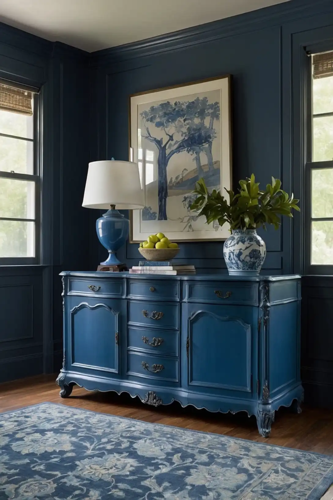
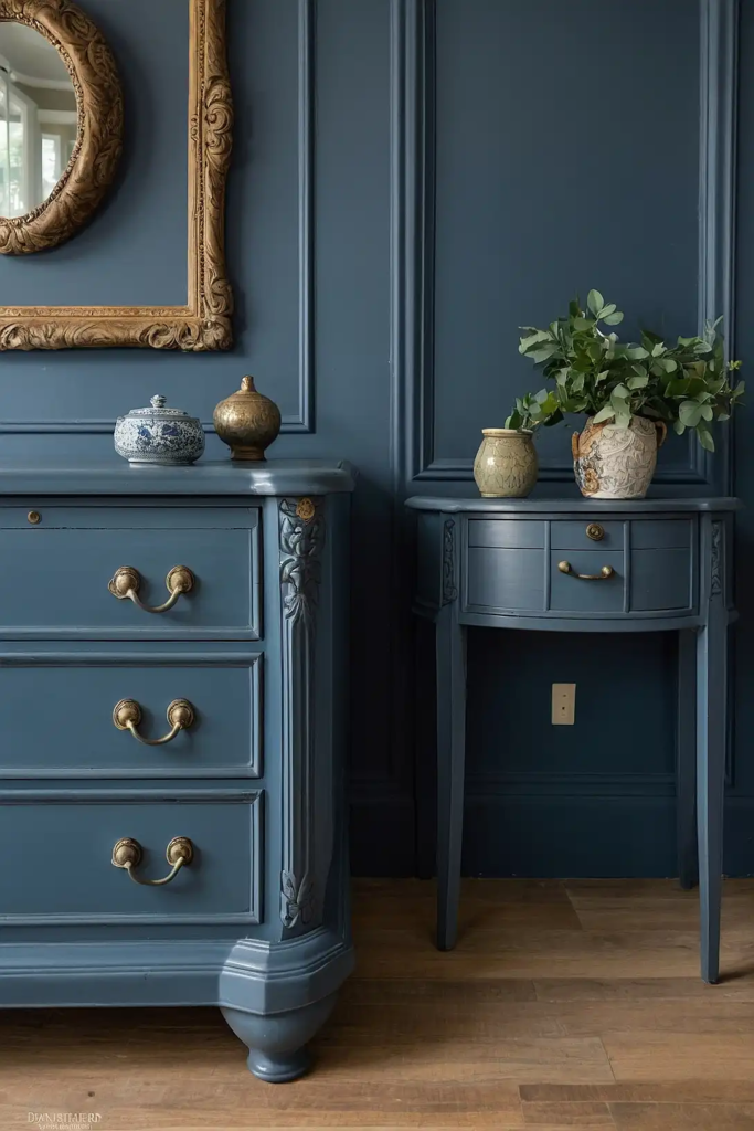
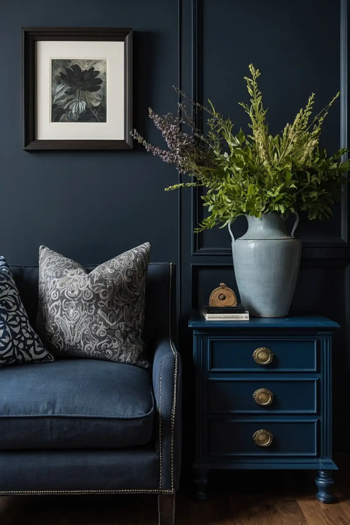
1: Classic Navy Blue
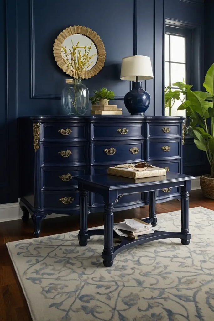
This timeless shade adds sophistication to any furniture piece while remaining versatile enough for various décor styles.
Navy creates dramatic impact without the harshness of black.
You’ll find this color particularly striking on larger pieces like dressers and buffets.
Pair with brass or gold hardware for a luxurious look that works in both traditional and contemporary settings.
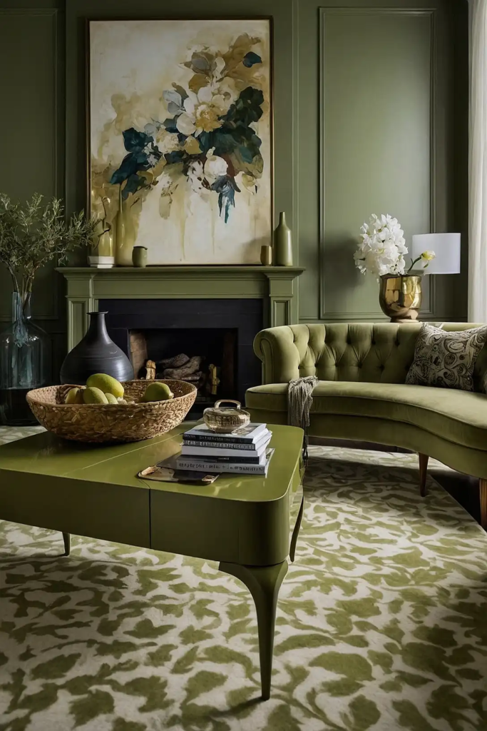
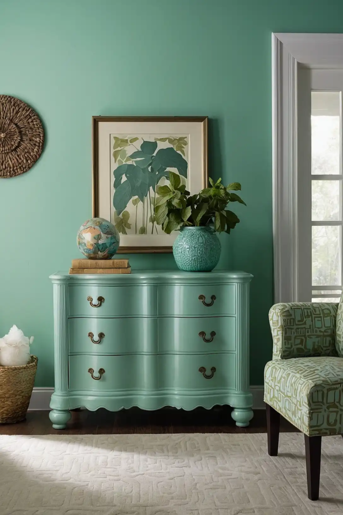
2: Soft Sage Green
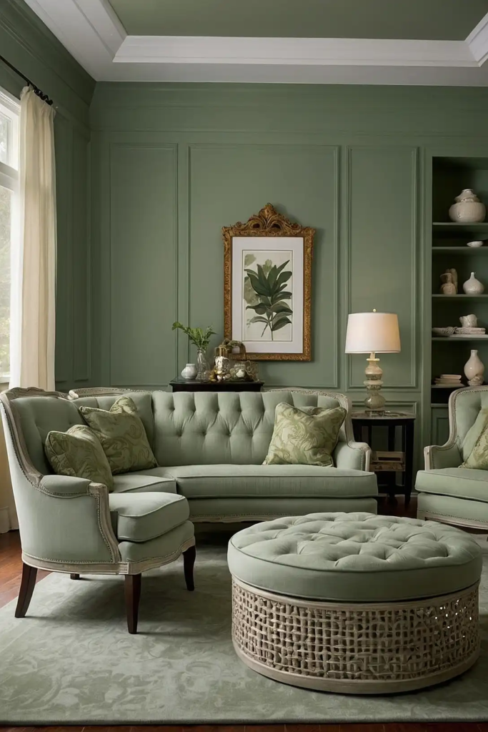
This versatile, nature-inspired hue brings subtle color while maintaining neutral flexibility.
Sage works beautifully across furniture styles from farmhouse to mid-century modern.
You’ll appreciate how this soothing color adds character without overwhelming your space.
It pairs exceptionally well with natural wood tones, making it perfect for partial painting techniques like dipped legs or two-tone designs.
3: Antique White
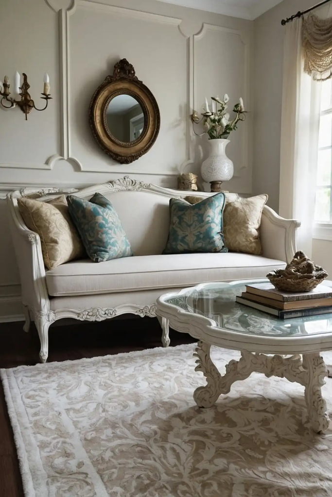
This soft, warm white creates timeless elegance without the harshness of bright white.
Antique white works beautifully on everything from ornate vintage pieces to clean-lined modern furniture.
You’ll love how this versatile neutral complements virtually any decor style or color scheme.
For added character, consider distressing or antiquing techniques that highlight the furniture’s details.
4: Charcoal Gray
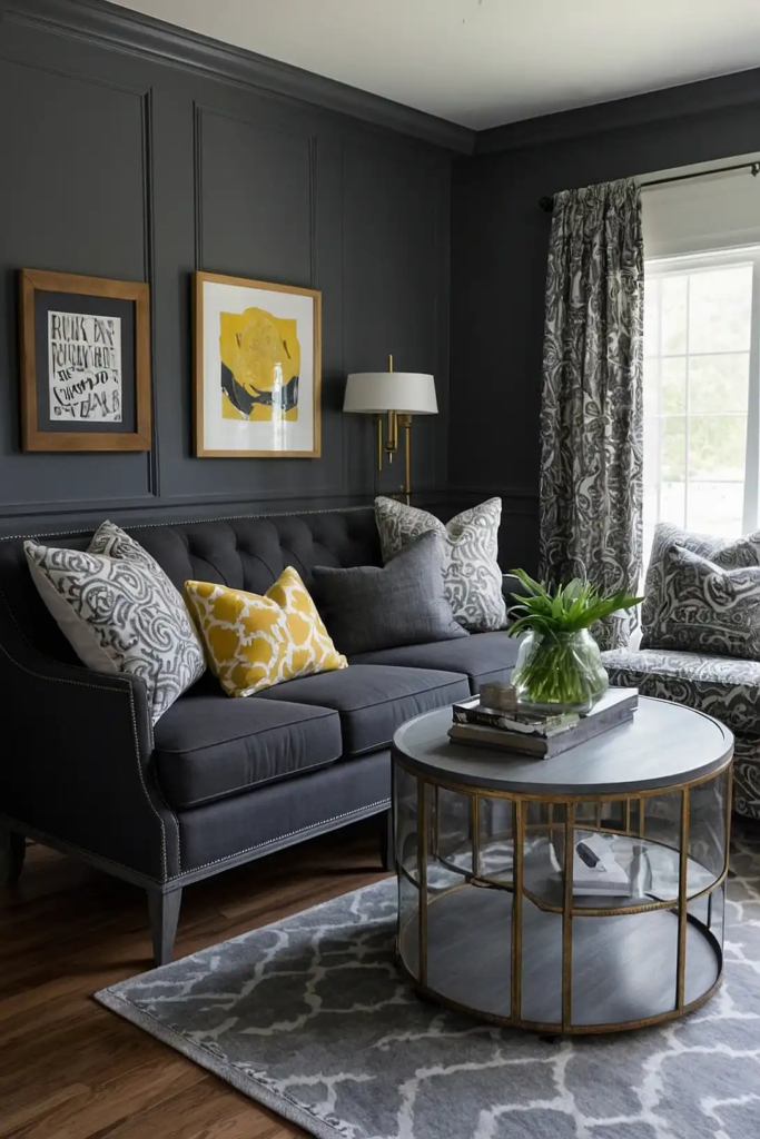
This sophisticated neutral adds drama and anchors your space without the heaviness of black.
Charcoal transforms ordinary furniture into statement pieces while maintaining versatility.
You’ll find this color particularly effective on architectural pieces with interesting lines or details.
It pairs beautifully with both warm and cool accent colors, providing maximum flexibility as your décor evolves.
5: Terracotta
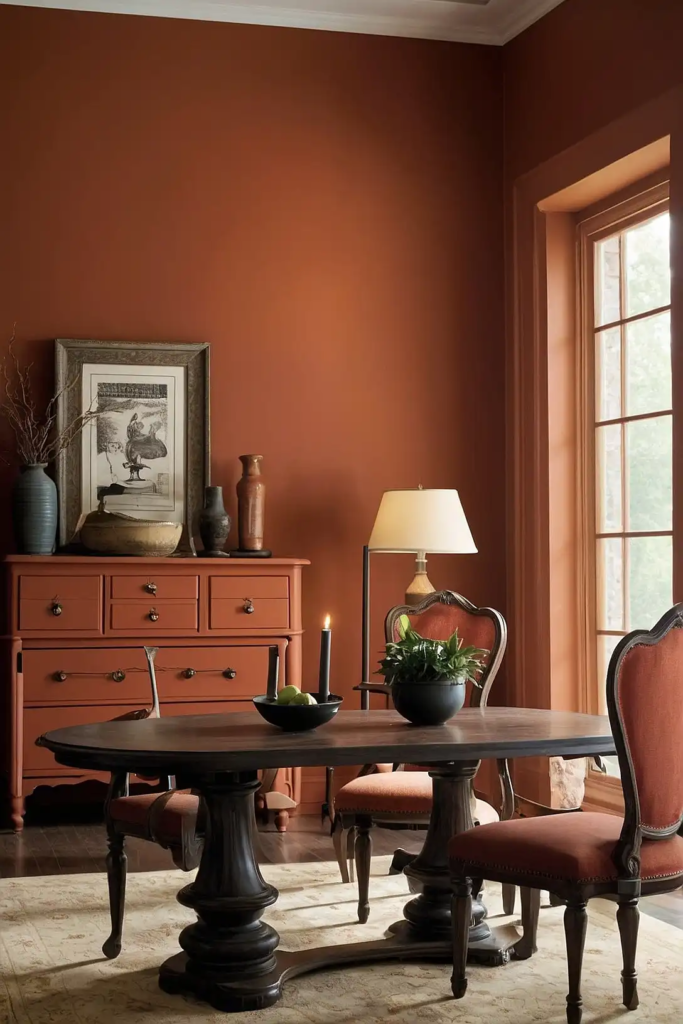
This warm, earthy tone brings Mediterranean charm to furniture pieces both large and small.
Terracotta adds unexpected character while connecting your space to nature’s palette.
You’ll notice how this color creates a focal point without overwhelming your room’s color scheme.
It works particularly well on accent pieces like side tables, coffee tables, or smaller chairs.
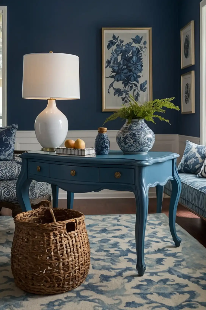
6: French Blue
This classic shade bridges the gap between true blue and gray for sophisticated versatility.
French blue brings character to furniture without dictating your overall color scheme.
You’ll appreciate how this timeless color works in various design styles from country French to contemporary.
It pairs beautifully with natural linens, brass hardware, and weathered wood for balanced contrast.
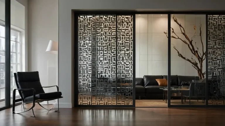
7: Matte Black
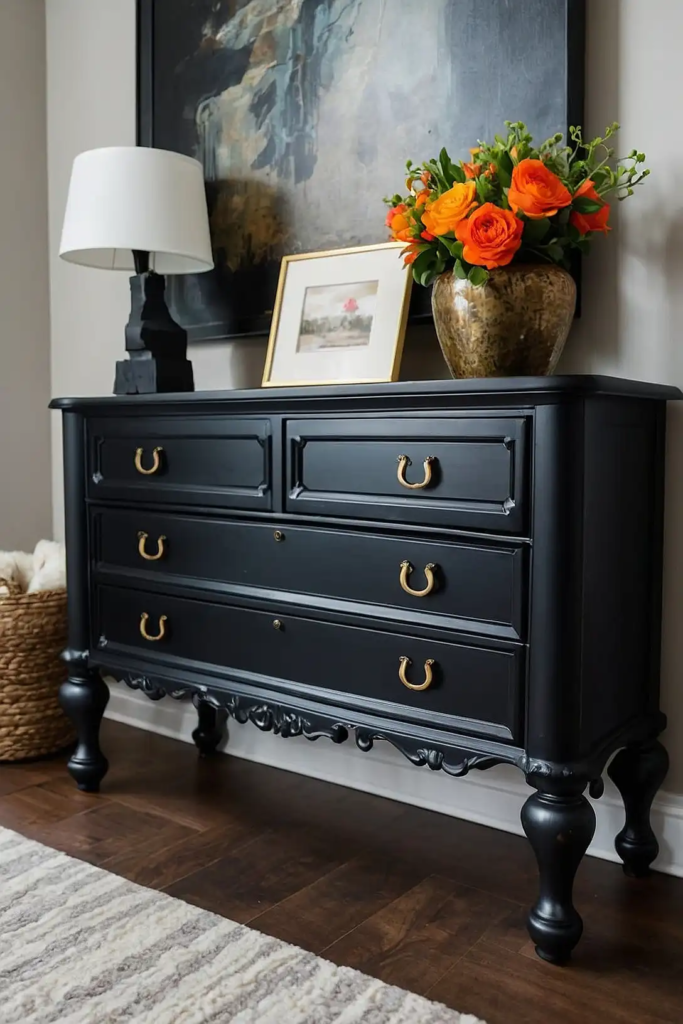
This bold classic transforms ordinary furniture into sophisticated statement pieces.
Black creates dramatic contrast while allowing your furniture’s lines and hardware to take center stage.
You’ll find this color particularly effective on pieces with interesting silhouettes or architectural details.
For maximum impact, ensure your black has a matte finish rather than high gloss, which shows imperfections more readily.
8: Soft Blush Pink
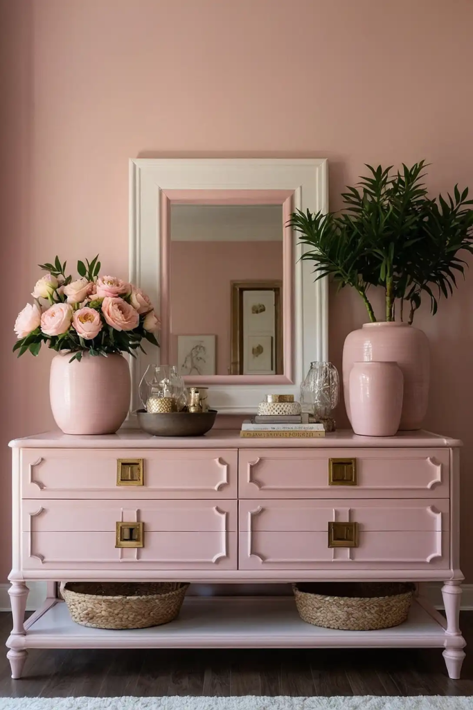
Don’t dismiss pink as juvenile—today’s blush tones read as sophisticated neutrals on furniture.
This subtle hue adds warmth and personality while maintaining remarkable versatility.
You’ll appreciate how this color creates unexpected interest, particularly on smaller accent pieces.
Pair with brass hardware and natural textures for a contemporary look that feels both fresh and timeless.
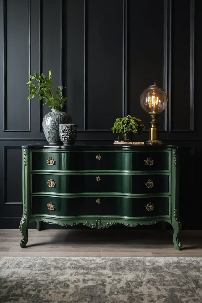
9: Deep Emerald Green
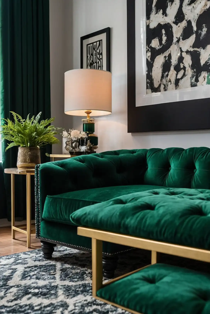
This rich jewel tone transforms ordinary furniture into luxurious statement pieces.
Emerald adds dramatic color while maintaining a timeless, classic feel that transcends trends.
You’ll notice how this color creates an instant focal point in any room.
It works particularly well on velvet-finished pieces or items with interesting architectural details you want to highlight.
10: Warm Greige
The perfect marriage of gray and beige, greige offers maximum versatility for furniture pieces.
This chameleon-like neutral adapts to your existing décor while adding subtle sophistication.
You’ll love how this color complements both warm and cool color schemes with equal ease.
It provides enough interest to stand alone while allowing other elements in your room to shine.
11: Butter Yellow
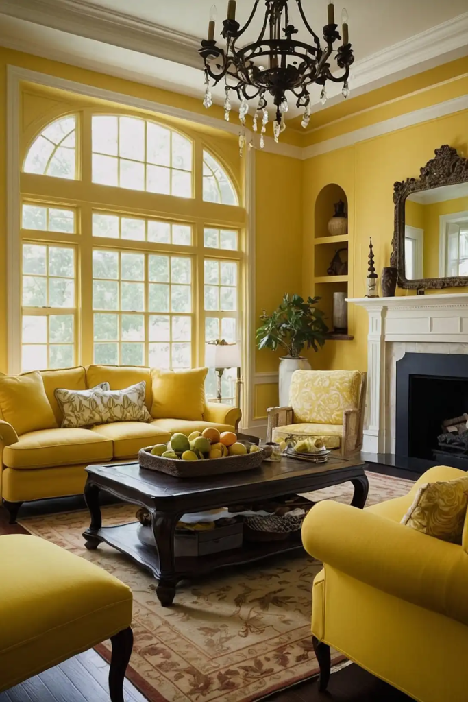
This cheerful hue adds unexpected personality to furniture without overwhelming your space.
Yellow brings warmth and energy, particularly effective in rooms that lack natural light.
You’ll find this color creates an instant mood-lifter on pieces like chairs, nightstands, or accent tables.
For a sophisticated look, choose a muted butter yellow rather than a bright primary tone.
12: Slate Blue
This muted, gray-influenced blue adds subtle character to furniture while maintaining remarkable versatility.
Slate blue brings depth and interest without dictating your overall color scheme.
You’ll appreciate how this sophisticated color bridges traditional and contemporary design styles.
It works beautifully on larger pieces like dressers, armoires, or dining tables that need refinement without boldness.
13: Soft Olive Green
This earthy, muted green brings natural warmth and character to furniture pieces. Olive creates subtle interest while maintaining the versatility of a neutral.
You’ll notice how this color connects beautifully to other natural elements in your space.
It pairs particularly well with leather, brass, and natural wood for a collected, timeless aesthetic.
14: Creamy Mushroom
This complex neutral with subtle purple-gray undertones creates sophisticated depth on furniture.
Mushroom offers enough color to be interesting while maintaining maximum versatility.
You’ll find this chameleon-like shade complements virtually any accent color or wood tone.
It’s particularly effective on pieces that bridge different rooms or design styles.
15: Classic Red
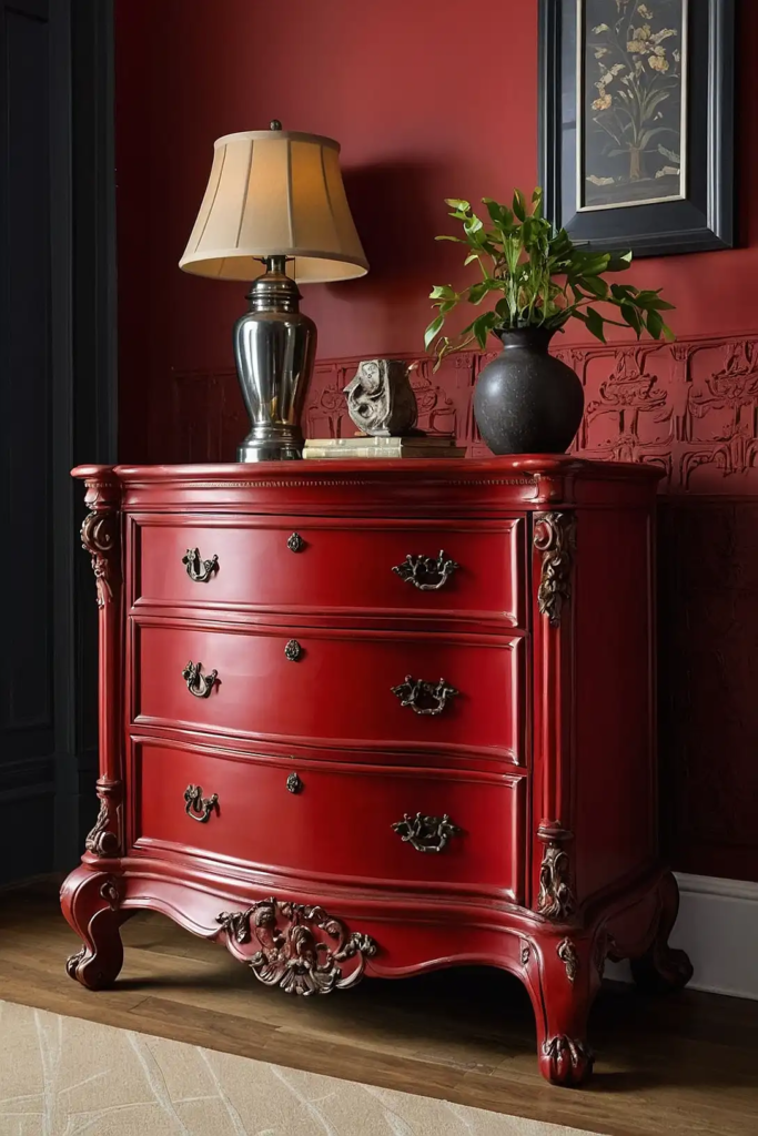
This timeless shade adds energy and character to furniture without feeling trendy.
Red creates dramatic impact, particularly effective on smaller accent pieces or chairs.
You’ll appreciate how this color can transform an ordinary item into your room’s focal point.
Choose a deeper, slightly muted red rather than a bright primary tone for more sophisticated longevity.
16: Soft Aqua
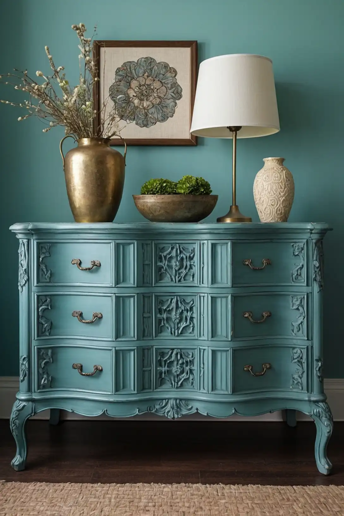
This refreshing blue-green hybrid adds personality to furniture while maintaining versatility.
Aqua brings subtle energy and character without overwhelming your existing color scheme.
You’ll notice how this color creates a cheerful accent without feeling childish or themed.
It works particularly well in spaces that need a touch of coastal or vintage charm.
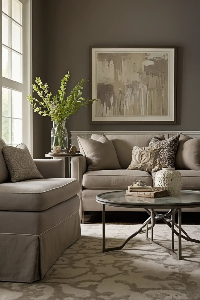
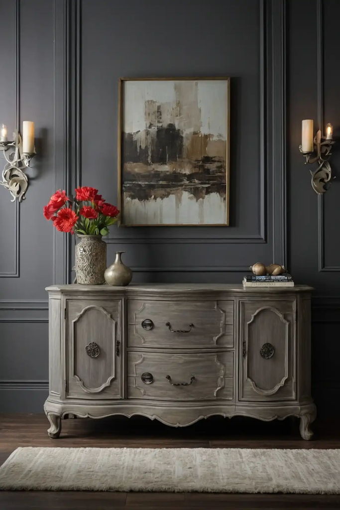
17: Warm Taupe
This sophisticated neutral bridges the gap between gray and brown for maximum versatility.
Taupe enhances your furniture’s lines while allowing it to integrate seamlessly with various décor styles.
You’ll love how this chameleon-like color adapts to changing light throughout the day.
It’s particularly effective on larger pieces that need to complement rather than compete with other elements.
18: Dusty Lavender

This unexpected choice adds subtle character to furniture without overwhelming your space.
Choose a heavily muted lavender with gray undertones for a sophisticated effect.
You’ll appreciate how this color adds unique personality without feeling overly feminine or trendy.
It works beautifully on accent pieces in bedrooms, living rooms, or home offices.
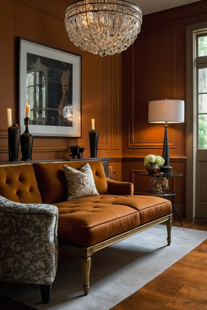
19: Rich Caramel
This warm, sophisticated neutral brings depth and richness to furniture without limiting your design options.
Caramel enhances traditional pieces while adding unexpected warmth to modern lines.
You’ll find this color creates a luxurious leather-like effect, particularly when paired with brass hardware.
It works beautifully on larger pieces that need to feel substantial without heaviness.
20: Colonial Blue
This historical shade brings timeless character to furniture while remaining remarkably versatile.
Colonial blue offers more personality than navy while maintaining sophisticated restraint.
You’ll appreciate how this color works across various design styles from traditional to farmhouse.
It pairs particularly well with natural wood tones and vintage-inspired hardware.
21: Soft Black-Green
This complex dark neutral offers sophisticated depth without the starkness of true black.
Black-green creates dramatic impact while maintaining subtle connection to nature.
You’ll notice how this color highlights your furniture’s architectural details and hardware.
It works beautifully on statement pieces with interesting silhouettes or historical significance.
22: Warm Cognac
This rich, amber-toned neutral mimics aged leather for instant character and warmth.
Cognac transforms ordinary furniture into pieces that look collected and curated over time.
You’ll find this color particularly effective on masculine-leaning designs or mid-century inspired pieces.
It pairs beautifully with brass, black, or dark bronze hardware for a cohesive look.
23: Pale Gray-Blue
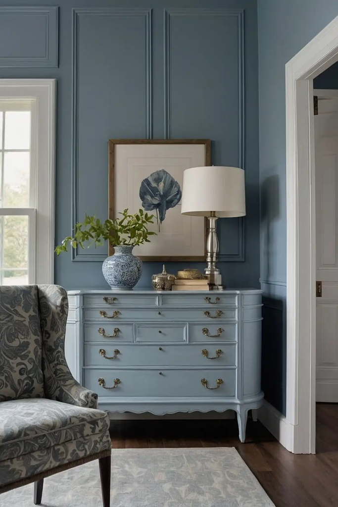
This subtle, sophisticated hybrid adds refinement to furniture without overwhelming your space.
Gray-blue creates interest while maintaining the versatility of a neutral.
You’ll appreciate how this chameleon-like color shifts throughout the day, creating visual dimension.
It’s particularly effective on larger pieces that need to feel substantial without heaviness.
24: Muted Coral
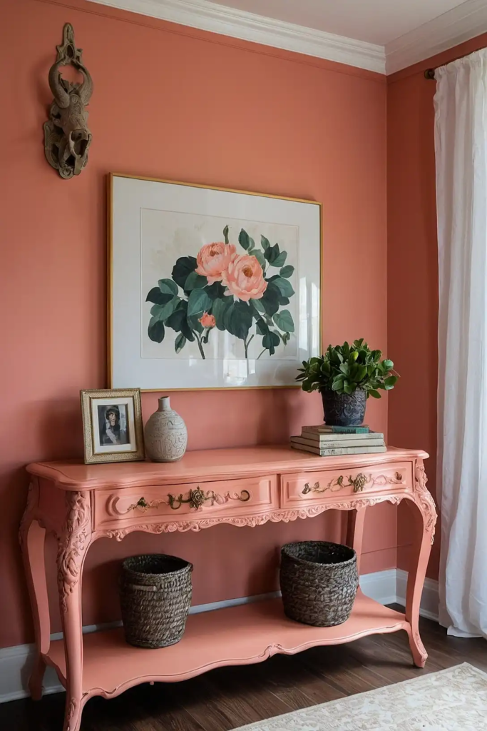
This warm, sophisticated hue adds unexpected character to furniture without feeling trendy.
Coral brings subtle energy and warmth without the commitment of brighter colors.
You’ll notice how this color creates a welcoming accent in otherwise neutral spaces.
It works particularly well on dining chairs, ottomans, or accent tables that benefit from gentle personality.
25: Dark Charcoal-Blue
This sophisticated hybrid creates drama without the harshness of pure black.
Charcoal-blue transforms ordinary furniture into statement pieces while maintaining subtle depth.
You’ll find this color particularly effective on architectural pieces with interesting lines or details.
The subtle blue undertones add richness that pure black or charcoal can’t achieve.
26: Fresh Mint
This light, energizing green adds personality to furniture while creating unexpected freshness.
Mint brings subtle color without the commitment of bolder hues.
You’ll appreciate how this color creates a cheerful accent without feeling childish.
It works particularly well on smaller pieces like nightstands, side tables, or accent chairs.
27: Weathered Gray
This versatile neutral mimics naturally aged wood for instant character and patina.
Weathered gray creates a timeless, collected look that works across various design styles.
You’ll notice how this color allows your furniture’s details and hardware to take center stage.
It’s particularly effective on pieces with interesting texture or architectural elements worth highlighting.
Conclusion
The perfect furniture paint color transforms ordinary pieces into personal treasures.
Choose colors that speak to your style while complementing your space, and you’ll create lasting pieces you’ll love for years to come.