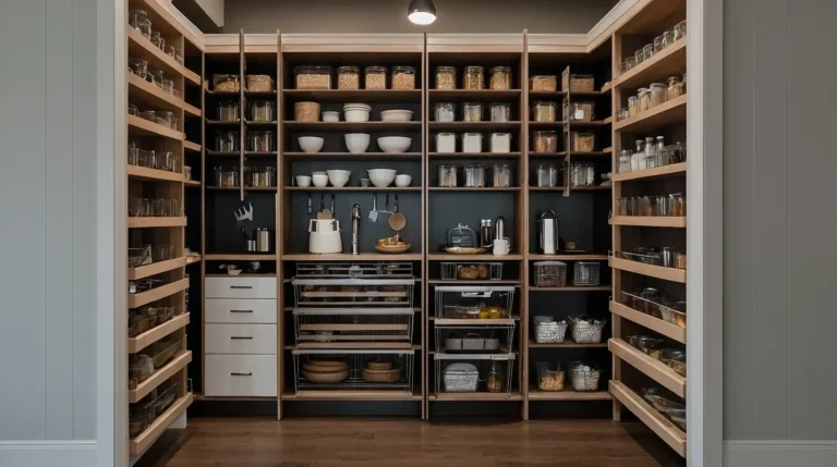
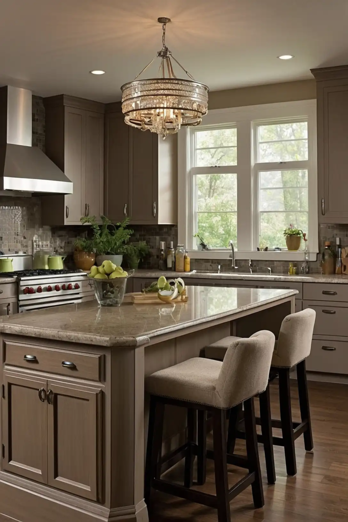
27 Best Kitchen Paint Colors With Honey Oak Cabinets: Transform Your Space Without Replacing Cabinets
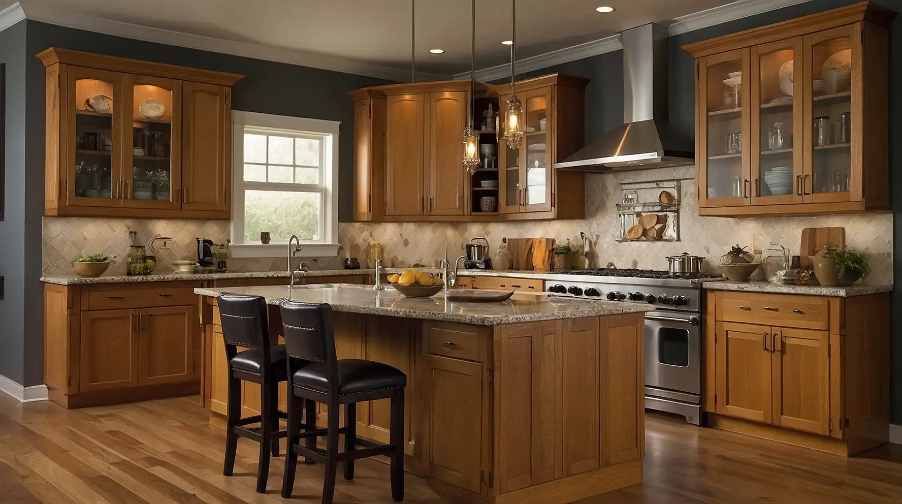
Honey oak cabinets were incredibly popular in homes built during the 1980s and 1990s, and many kitchens still feature this warm, golden-toned wood today.
While you might feel stuck with these cabinets, the right wall color can completely transform your space.
Choosing a complementary paint color lets you work with—not against—your honey oak cabinets.
The perfect shade will highlight their warm undertones while creating a fresh, updated look.
Ready to fall back in love with your kitchen?
These 27 paint colors specifically chosen to pair with honey oak will help you create a space that feels both timeless and current.
1: Sage Green

This muted, earthy green creates a natural partnership with honey oak’s warm tones.
Sage offers enough color to make a statement while remaining neutral enough for everyday living.
The combination evokes a subtle farmhouse aesthetic without feeling themed or dated.
This versatile shade works in both north-facing and south-facing kitchens, adapting beautifully to different lighting conditions.
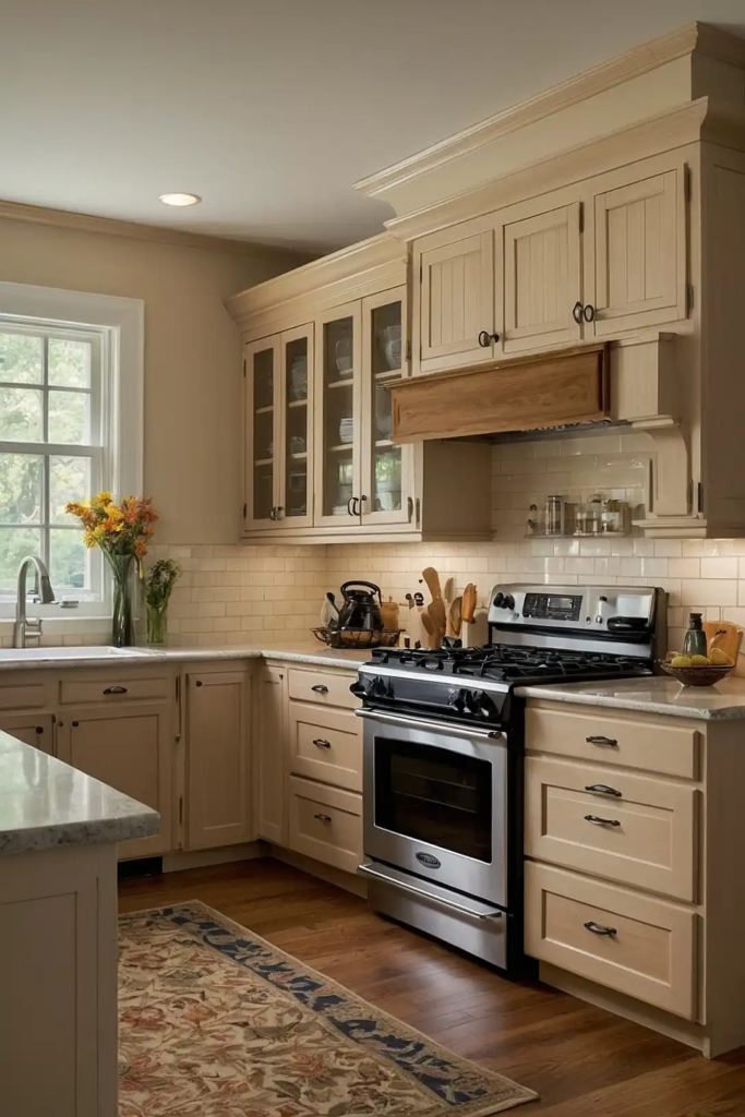
2: Creamy Off-White
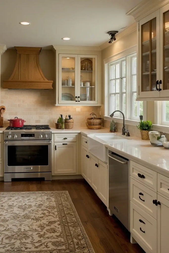
A warm off-white with subtle yellow undertones creates harmony with honey oak without competing for attention.
This pairing brightens your kitchen while maintaining a cohesive, seamless look.
Designers often recommend this combination for smaller kitchens where visual continuity makes the space feel larger.
The creamy backdrop lets your cabinets become a natural focal point.
3: Soft Gray-Blue

This versatile, muted shade balances honey oak’s warmth with cool undertones that feel fresh and current.
The slight contrast creates visual interest while the muted quality keeps the look sophisticated.
Blue-gray walls make honey oak appear more intentional and less dated.
This combination works particularly well in kitchens with stainless steel appliances, creating a bridge between warm and cool elements.
4: Warm Greige
The perfect hybrid of gray and beige, greige complements honey oak by picking up on its neutral undertones while adding contemporary sophistication.
This chameleon-like color shifts subtly throughout the day.
Designers love this pairing for its versatility and timeless appeal.
Greige provides just enough contrast to make your cabinets pop without creating jarring visual transitions.
5: Terracotta

Embrace warmth with this earthy, clay-inspired hue that enhances honey oak’s golden tones.
Terracotta creates a cohesive, sunbaked aesthetic that feels both timeless and on-trend.
The color brings Mediterranean or Southwest vibes without feeling themed.
This rich neutral pairs beautifully with both stainless and brass hardware, allowing flexibility with your accessories.
6: Soft Lavender

This unexpected choice creates subtle contrast with honey oak while adding unique character.
Choose a heavily muted lavender that reads almost as a neutral for a sophisticated, not-too-purple effect.
The cool undertones balance the warmth of the wood, creating a dynamic but harmonious relationship.
This combination feels fresh and distinctive without being polarizing.
7: Slate Blue

This deep, muted blue offers enough gravity to balance honey oak’s golden hue.
Slate blue creates a stately, classic look that elevates the entire kitchen with minimal effort.
The color combination bridges traditional and contemporary styles effectively.
It works particularly well in kitchens with good natural light, where the blue retains its richness without darkening the space.
8: Soft Wheat

Creating a tonal relationship with your cabinets, wheat walls produce a seamless, cohesive look.
This barely-there color difference adds dimension without contrast, perfect for open-concept spaces.
This pairing creates a warm, inviting atmosphere that feels connected to nature.
The subtle color allows your cabinet hardware and accessories to take center stage.
9: Light Olive

This muted green-gray strikes the perfect balance between color and neutral.
Light olive harmonizes with honey oak’s warm undertones while providing subtle contrast.
The earthy quality of this shade makes it particularly well-suited for kitchens that open to outdoor views.
This combination creates a seamless transition between indoor and outdoor spaces.
10: Creamy Mushroom

This complex neutral with subtle purple-gray undertones creates sophisticated depth alongside honey oak.
Mushroom offers enough contrast to distinguish walls from cabinets without harsh transitions.
The earthy quality of this shade complements the natural wood beautifully.
This versatile pairing works well with various countertop materials, from granite to butcher block.
11: Pale Aqua

This refreshing color adds personality while still harmonizing with honey oak’s warm tones.
Choose a muted, gray-influenced aqua rather than a bright turquoise for a more sophisticated effect.
The subtle contrast creates visual interest without overwhelming the space.
This combination creates a cheerful, welcoming kitchen without veering into themed territory.
12: Rich Cream

Slightly deeper than off-white, rich cream picks up on the golden highlights in honey oak for a seamless, coordinated look.
This pairing creates a bright kitchen that still feels warm and inviting.
Designers recommend this combination for kitchens with limited natural light, where the reflective quality maximizes brightness.
The warm undertones create a subtle glow throughout the day.
13: Muted Navy

For a bold yet classic look, deep navy creates dramatic contrast with honey oak while remaining timeless.
The warmth of the wood prevents the navy from feeling too cold or severe.
This high-contrast combination feels surprisingly balanced and works in both traditional and contemporary kitchens.
Navy acts almost as a neutral, allowing flexibility with accessories and accents.
14: Taupe

This sophisticated neutral bridges the gap between gray and brown, perfectly complementing honey oak’s warmth.
Taupe creates subtle contrast while maintaining an overall harmonious look.
The chameleon-like quality of taupe adapts to different lighting conditions throughout the day.
This versatile pairing works with virtually any accent color you might introduce.
15: Muted Coral

This warm, subtle hue enhances the golden tones in honey oak without competing for attention.
Choose a heavily muted, dusty coral rather than a bright version for sophisticated harmony.
The warm-on-warm combination creates a welcoming, cheerful kitchen with personality.
This pairing works particularly well in kitchens that receive morning light.
16: Coffee

For a rich, sophisticated look, deep coffee-colored walls create dramatic contrast with honey oak.
This pairing feels grounded and timeless while adding depth to your kitchen.
The combination works particularly well in larger kitchens where darker walls won’t shrink the space.
Coffee walls make honey oak appear more intentional and less builder-grade.
17: Soft Mint

This light, fresh green adds personality while still harmonizing beautifully with honey oak.
The cooling effect of mint balances the warmth of the wood for a dynamic relationship.
The combination feels clean and refreshing without being overly trendy. This pairing works especially well in kitchens with plenty of natural light.
18: Warm Putty

This complex neutral with slight green undertones creates subtle sophistication alongside honey oak.
Putty offers just enough contrast to distinguish walls from cabinets without harsh transitions.
The earthy quality complements the natural wood beautifully. This versatile pairing adapts well to both traditional and transitional kitchen styles.
19: Pale Yellow

Embrace warmth with this sunny hue that enhances honey oak’s golden tones.
Choose a muted, buttery yellow rather than a bright lemon for a more sophisticated effect.
The tonal relationship creates a cheerful, cohesive look without contrast.
This combination brings natural warmth to north-facing kitchens or spaces with cooler light.
20: Charcoal

For a contemporary update, deep charcoal creates dramatic contrast with honey oak.
This unexpected pairing makes the cabinets look intentionally chosen rather than builder-grade leftovers.
The combination bridges traditional and modern aesthetics effectively.
Charcoal provides a sophisticated backdrop that allows both the wood grain and your accessories to stand out.
21: Dusty Blue

This muted, gray-influenced blue creates subtle contrast with honey oak while maintaining a serene atmosphere.
The cool undertones balance the warmth of the wood beautifully.
This versatile pairing works in various design styles from farmhouse to traditional.
Dusty blue walls make stainless steel appliances and fixtures blend seamlessly into the overall design.
22: Warm Clay

This earthy neutral enhances honey oak’s natural warmth while adding depth and sophistication.
Clay creates a subtle connection to nature that feels both timeless and current.
The rich undertones vary beautifully throughout the day as light changes.
This combination creates a welcoming atmosphere perfect for the heart of your home.
23: Soft Almond
This warm neutral creates a seamless transition from walls to cabinets, perfect for open-concept spaces.
Almond picks up on the subtle undertones in honey oak for a cohesive look.
The barely-there contrast adds dimension without visual interruption. This pairing creates a bright, airy kitchen that still feels warm and inviting.
24: Forest Green

For a bold yet classic look, deep forest green creates dramatic contrast with honey oak.
This rich color has historical roots in traditional design, lending timeless appeal to your kitchen.
The combination feels connected to nature while remaining sophisticated.
Forest green pairs beautifully with both stainless and brass hardware, offering flexibility with your accessories.
25: Muted Turquoise

This personality-filled color adds character while still complementing honey oak’s warm tones.
Choose a heavily muted, gray-influenced turquoise for a sophisticated rather than tropical effect.
The contrast creates visual interest without overwhelming the space.
This combination works particularly well in kitchens with good natural light, where the color retains its richness.
26: Warm Stone

This complex neutral with slight olive undertones creates subtle sophistication alongside honey oak.
Stone offers enough contrast to distinguish walls from cabinets without harsh transitions.
The earthy quality complements the natural wood grain beautifully. This versatile pairing adapts well to changing design trends and personal accessories.
27: Creamy Butter

This warm, golden-toned neutral creates a seamless, sun-kissed look with honey oak cabinets.
The tonal relationship produces a bright, cohesive space without strong contrast.
The subtle color difference adds dimension while maintaining visual flow.
This combination brings natural warmth to kitchens with cooler exposures or limited natural light.
Conclusion
The right paint color transforms your honey oak kitchen from dated to deliberate.
Embrace these cabinets’ natural warmth by choosing a complementary color that creates your ideal atmosphere—whether calm and neutral or rich and distinctive.