27 Best Whole House Paint Colors That Transform Any Space
Choosing the perfect paint color for your entire home can feel overwhelming.
With thousands of options available, how do you find that perfect shade that works across different rooms and lighting conditions?
We’ve curated the 27 best whole house paint colors that professional designers consistently recommend.
These versatile hues create a cohesive flow throughout your home while still allowing each room to maintain its unique character.
Ready to transform your space with just a few gallons of paint? Let’s dive into the colors that designers swear by for whole-house harmony.
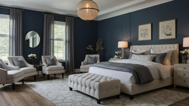
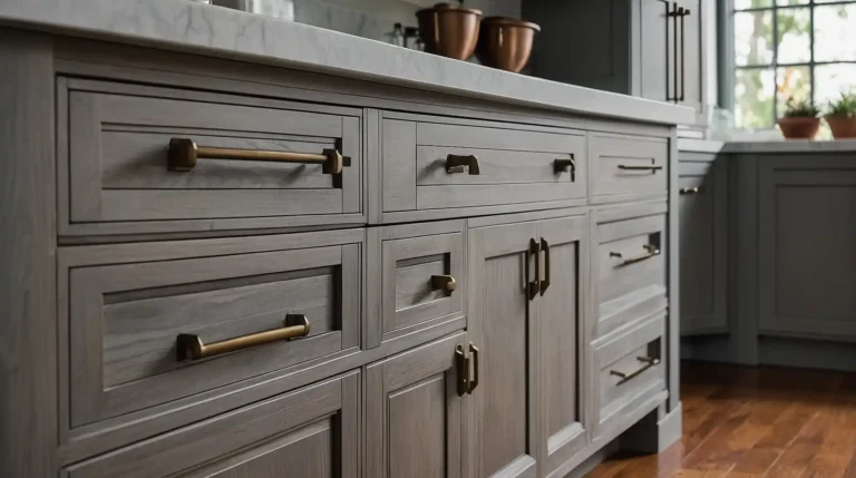
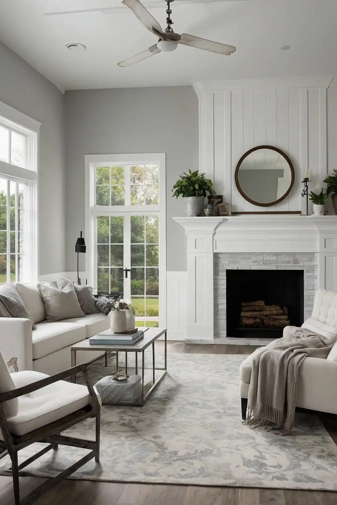
1: Agreeable Gray (Sherwin-Williams)
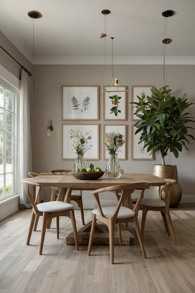
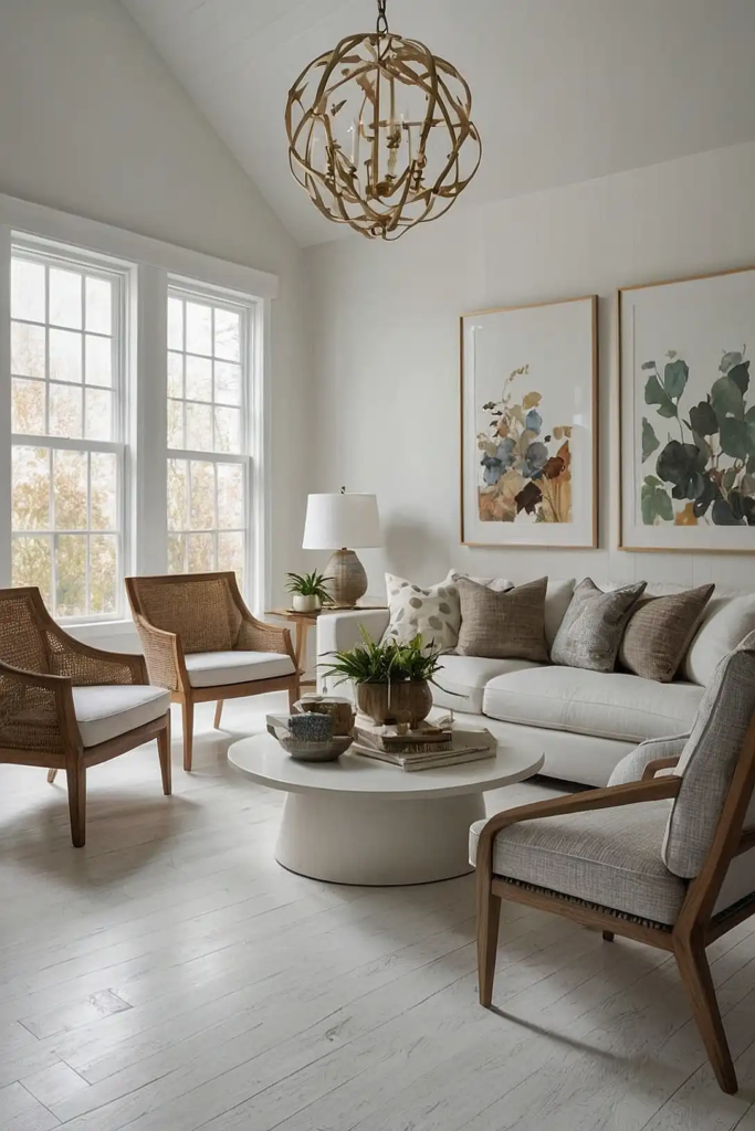
This beloved greige (gray-beige hybrid) creates the perfect neutral backdrop for any home.
You’ll appreciate how it shifts subtly throughout the day, appearing warmer in natural light and cooler in shadows.
It pairs beautifully with both warm and cool accent colors, making it incredibly versatile for your entire home.
Many designers consider this the ultimate “can’t go wrong” whole house color.
2: Simply White (Benjamin Moore)
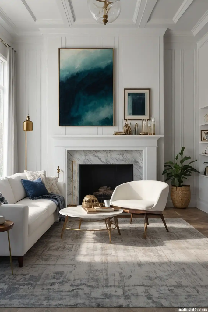
This clean, crisp white avoids feeling sterile thanks to its subtle warm undertones. You’ll notice how it brightens spaces without the harsh, clinical feel of pure whites.
It works beautifully in both traditional and modern homes, serving as either a main color or trim complement.
The versatility makes it perfect for maintaining consistency throughout your home.
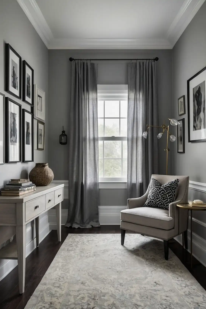
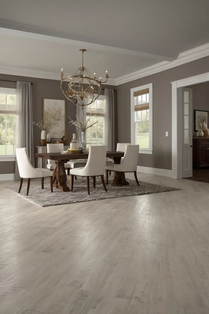
3: Repose Gray (Sherwin-Williams)
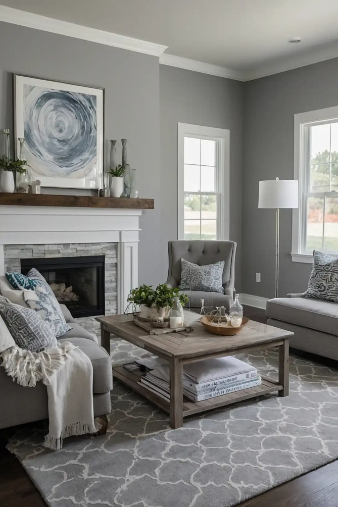
You’ll find this medium-light gray brings a sophisticated, calming presence to any room. Its balanced undertones prevent it from feeling too cool or too warm.
This adaptability makes it ideal for open floor plans where lighting changes dramatically.
Designers love how it creates a cohesive foundation without dominating your décor choices.
4: Pale Oak (Benjamin Moore)
This soft, sophisticated greige gives your walls a warm glow without feeling yellow.
You’ll appreciate how it creates a subtle, elegant backdrop that never competes with your furnishings.
It transitions beautifully between rooms with different lighting conditions.
The color’s depth changes subtly throughout the day, keeping your spaces feeling dynamic.
5: Accessible Beige (Sherwin-Williams)

You’ll love how this balanced beige avoids the “boring beige” stereotype with its subtle depth.
It provides warmth without the yellow undertones that can make spaces feel dated.
This color creates a welcoming atmosphere in any room.
It complements both traditional and contemporary design elements, making it perfect for homes with mixed décor styles.
6: Swiss Coffee (Benjamin Moore)
This creamy off-white brings cozy sophistication to any space. You’ll notice how it softens rooms that might feel stark with a brighter white.
Its subtle warmth creates an inviting atmosphere without venturing into yellow territory.
Designers recommend this for homes where you want brightness but with a touch of warmth.
7: Revere Pewter (Benjamin Moore)
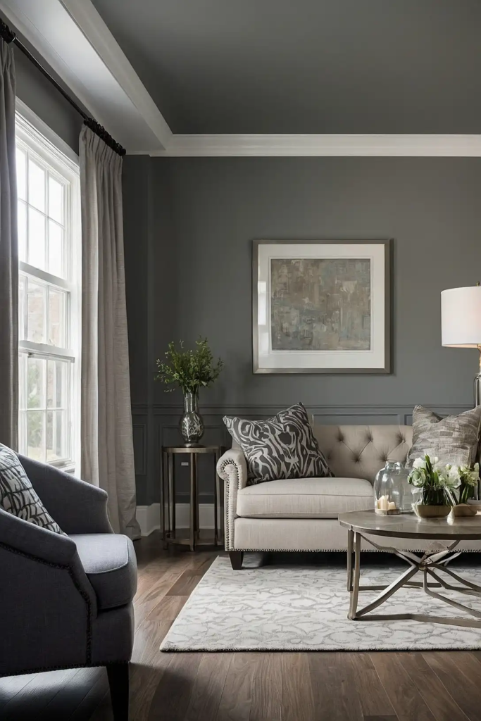
You’ll appreciate this perfect greige that leans slightly toward the warm side.
It creates harmony between rooms with different light exposures and maintains its appeal in both daylight and artificial light.
This color has stood the test of time, remaining popular for whole-house color schemes for over a decade.
It pairs beautifully with both wood tones and contemporary elements.
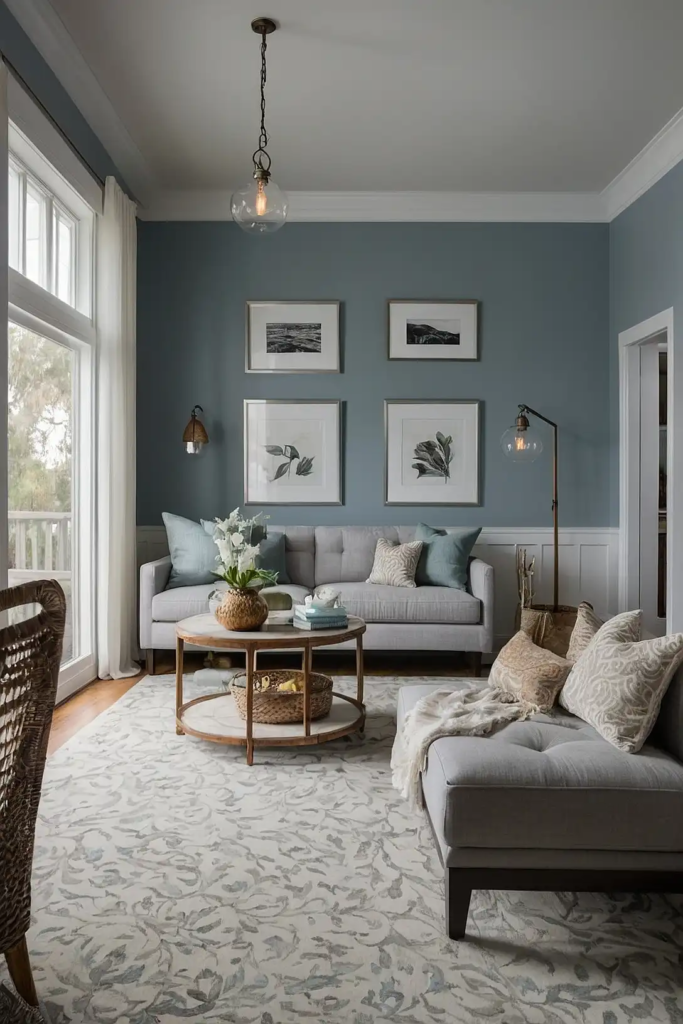
8: Sea Salt (Sherwin-Williams)
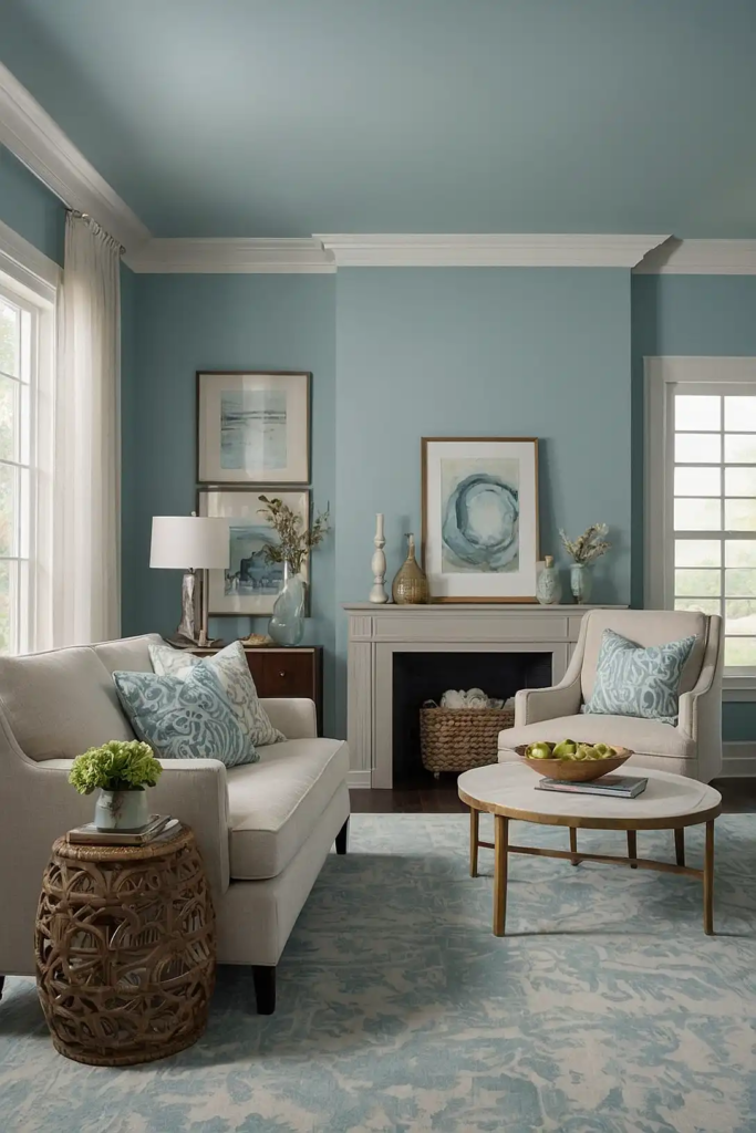
This tranquil blue-green-gray chameleon color shifts beautifully throughout the day.
You’ll love how it can appear more blue, green, or gray depending on your lighting.
It brings a subtle coastal vibe without feeling themed or trendy.
This versatility makes it perfect for creating flow between different rooms while still providing visual interest.
9: Stonington Gray (Benjamin Moore)
You’ll find this true gray strikes the perfect balance between warm and cool undertones.
It creates a sophisticated backdrop that works with virtually any décor style.
This color maintains its character throughout the day, providing consistency across different lighting conditions.
Designers frequently recommend it for clients who want a modern yet timeless feel.
10: Edge-comb Gray (Benjamin Moore)
This soft, muted greige feels both fresh and timeless. You’ll appreciate how it creates a subtle, sophisticated backdrop that allows your furnishings to shine.
It transitions seamlessly between spaces with different light exposures.
The color’s balanced undertones prevent it from feeling too warm or too cool in any environment.
11: Alabaster (Sherwin-Williams)
You’ll love this soft, warm white that provides brightness without harshness. It creates a clean canvas that still maintains character and depth.
This color works wonderfully throughout an entire home, never feeling too stark.
Its subtle warmth complements both traditional wood elements and modern decorative accents.
12: Classic Gray (Benjamin Moore)
This ethereal, light gray creates an airy feeling in any space. You’ll notice how it almost appears to float on your walls, creating a sense of expansiveness.
It works beautifully in homes with limited natural light, brightening spaces without feeling cold.
Designers love its ability to make smaller rooms feel larger and more open.
13: Light French Gray (Sherwin-Williams)
You’ll appreciate this sophisticated mid-tone gray with subtle blue undertones.
It creates a refined atmosphere that works in both traditional and contemporary settings.
This color maintains its character throughout the day, providing consistency between rooms.
It pairs beautifully with white trim to create classic architectural interest.
14: Collingwood (Benjamin Moore)
This versatile greige adapts beautifully to different lighting conditions. You’ll notice how it can appear more gray in some spaces and more beige in others.
It creates a subtle, sophisticated backdrop for any décor style.
Designers recommend it for homes where you want continuity without sacrificing visual interest.
15: Gray Owl (Benjamin Moore)
You’ll find this light gray has just enough warmth to feel inviting rather than cold. It creates a contemporary vibe without feeling trendy or temporary.
This color works exceptionally well in homes with mixed lighting conditions. Its chameleon-like quality helps maintain visual consistency between different spaces.
16: Agreeable Taupe (Sherwin-Williams)
This rich, warm neutral brings depth without heaviness. You’ll appreciate how it creates a cozy feeling without darkening your spaces.
It pairs beautifully with both cool and warm accent colors. This versatility makes it perfect for homes where you want flexibility in your decorative choices.
17: White Dove (Benjamin Moore)
You’ll love this soft white with subtle warm undertones that prevent it from feeling stark. It creates brightness while maintaining a comfortable, lived-in feel.
This color works beautifully throughout an entire home, from trim to walls to ceilings.
Its balanced undertones make it one of the most versatile whites available.
18: Worldly Gray (Sherwin-Williams)
This balanced greige creates a sophisticated backdrop for any space.
You’ll notice how it shifts subtly throughout the day, revealing different undertones as lighting changes.
It transitions seamlessly between rooms with different exposures.
This adaptability makes it perfect for open floor plans where maintaining color continuity is essential.
19: Pale Silver (Benjamin Moore)
You’ll appreciate this ethereal gray-blue that brings a subtle, sophisticated vibe to any space. It creates a sense of tranquility without feeling cold or uninviting.
This color works beautifully in both north and south-facing rooms.
Its chameleon-like quality helps maintain visual harmony throughout different spaces in your home.
20: Mindful Gray (Sherwin-Williams)
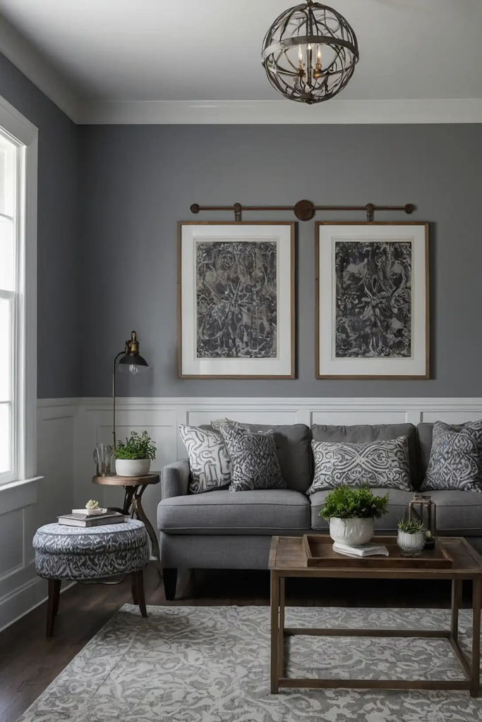
This rich mid-tone gray brings sophistication and depth to your spaces. You’ll love how it creates a dramatic yet neutral backdrop for your furnishings and art.
It pairs beautifully with both cool and warm accent colors.
This versatility makes it perfect for creating a cohesive framework that still allows for creativity in each room.
21: Manchester Tan (Benjamin Moore)
This versatile neutral leans slightly warmer than greige but avoids yellow undertones.
You’ll appreciate how it creates a welcoming atmosphere without feeling dated.
It transitions beautifully between rooms with different lighting conditions.
Designers recommend it for homes where you want warmth without committing to a more colorful palette.
22: Aesthetic White (Sherwin-Williams)
You’ll find this warm off-white brings subtle depth to your walls without reading as a definitive color. It creates brightness while maintaining character and warmth.
This color works wonderfully throughout an entire home, from walls to trim.
Its versatility makes it perfect for creating a consistent backdrop that complements any décor style.
23: Pale Oak (Benjamin Moore)
This sophisticated greige creates subtle elegance in any space.
You’ll appreciate how it recedes into the background, allowing your furnishings and art to take center stage.
It adapts beautifully to different lighting conditions throughout the day. This chameleon-like quality helps maintain visual consistency between different rooms.
24: Balanced Beige (Sherwin-Williams)
You’ll love this warm neutral that brings cozy sophistication to any space. It creates depth without heaviness, avoiding the flat feeling some beiges can have.
This color transitions seamlessly between rooms with different light exposures.
Its versatility makes it perfect for creating a cohesive environment throughout your entire home.
25: Paper White (Benjamin Moore)
This ethereal white with subtle gray undertones creates brightness without harshness.
You’ll notice how it brings a contemporary feel without the stark quality of pure whites.
It works beautifully in homes with limited natural light, brightening spaces without feeling cold.
Designers recommend it for creating a clean, modern aesthetic throughout your home.
26: Silver Strand (Sherwin-Williams)
You’ll appreciate this sophisticated blue-gray-green that brings subtle color while still functioning as a neutral.
It creates visual interest without overwhelming your spaces.
This color shifts beautifully throughout the day, revealing different undertones as lighting changes.
Its versatility makes it perfect for creating flow between different rooms.
27: Wickham Gray (Benjamin Moore)
This soft, subtle gray with blue-green undertones brings a refreshing quality to any space.
You’ll love how it creates a tranquil atmosphere without feeling cold or sterile.
It transitions seamlessly between different lighting conditions.
Designers recommend it for homes where you want a hint of color while maintaining a neutral backdrop.
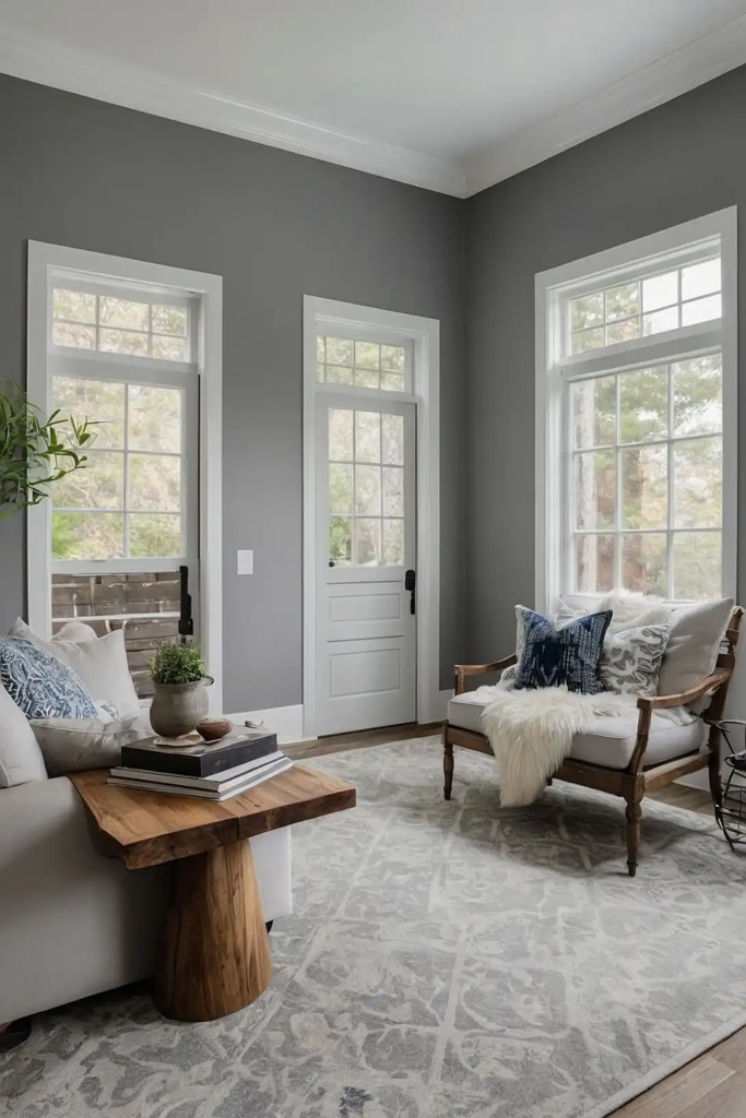
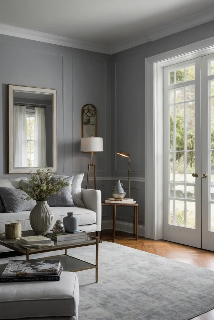
Conclusion
The perfect whole-house color creates harmony while adapting to different spaces.
Choose one of these versatile shades to transform your home with a cohesive look that still allows each room its unique character.