27 Best Paint Colors for Guest Bedrooms That Will Wow Your Visitors
Your guest bedroom should strike the perfect balance between welcoming comfort and memorable style.
The right paint color sets the foundation for this important space, creating an atmosphere that makes visitors feel both special and at ease.
Unlike your primary bedroom, a guest room serves diverse visitors with different tastes and preferences.
The ideal color creates a versatile backdrop that appeals to most people while still reflecting your home’s personality.
Ready to transform your guest space from forgettable to fabulous?
These 27 paint colors will help you create a guest bedroom that impresses visitors and makes them feel perfectly at home.
1: Soft Sage Green

Soft sage green creates a naturally calming atmosphere that helps guests relax after their travels.
This versatile neutral-leaning green works with virtually any décor style from traditional to contemporary.
The organic quality brings the outdoors in, making the space feel fresh and rejuvenating.
Choose a sage with gray undertones for a sophisticated look that appeals to a wide range of guests.
This adaptable color pairs beautifully with both warm woods and cool metals, giving you flexibility with your furniture and accessory choices.
2: Warm Greige

Warm greige—that perfect blend of gray and beige—creates a sophisticated neutral foundation that appeals to nearly everyone.
This chameleon-like color shifts subtly throughout the day, adding interest without overwhelming.
Unlike pure gray, which can feel cold, greige maintains essential warmth that makes your guest room feel welcoming.
It pairs beautifully with virtually any accent color or wood tone.
This versatile neutral allows your decorative elements to shine while providing a current, updated backdrop that won’t alienate traditional or conservative guests.
3: Pale Lavender

Pale lavender brings subtle elegance to your guest room with its unexpected sophistication.
This light purple with gray undertones creates a tranquil atmosphere perfect for resting travelers.
Choose a very subtle lavender—almost a neutral with just a hint of color—to ensure broad appeal.
It pairs beautifully with crisp whites, silver, and natural wood elements.
This soft color flatters most skin tones, making your guests look and feel their best during their stay in your home.
4: Soft Blue-Gray

Soft blue-gray creates a serene, spa-like retreat that helps guests decompress after travel.
This sophisticated hybrid color adds subtle interest without the commitment of a more definitive color choice.
The gray component keeps the blue sophisticated and mature rather than juvenile or themed.
It pairs beautifully with both warm and cool accent colors, giving you decorating flexibility.
This adaptable color works in any lighting condition and complements most architectural styles, making it a safe yet stylish choice for your guest space.
5: Warm Cream

Warm cream provides a rich, welcoming backdrop that makes guests feel instantly at ease.
Unlike stark white, cream offers essential warmth that creates a cozy, inviting atmosphere.
The subtle yellow undertones bring a sunny quality even to rooms with limited natural light.
It pairs beautifully with virtually any accent color, from vibrant brights to sophisticated neutrals.
This timeless neutral allows your guest room furniture and accessories to take center stage while providing a flattering backdrop for visitors of all ages.
6: Dusty Blue

Dusty blue creates a tranquil, dreamy atmosphere that encourages relaxation and restful sleep for your travelers.
This muted blue with gray undertones offers sophistication beyond typical blue rooms.
The subtle color creates interest without overwhelm, allowing guests to feel the space is special without being too stylized or theme-driven.
It pairs beautifully with warm metals and natural linens.
This versatile color shifts throughout the day, appearing more gray in some lights and more blue in others, creating visual interest for longer-term guests.
7: Light Taupe

Light taupe creates a sophisticated neutral backdrop with essential warmth that welcomes visitors.
This complex beige with gray undertones offers more character than typical neutrals without alienating traditional guests.
The chameleon-like quality adapts to different lighting conditions throughout the day, adding subtle interest for guests spending significant time in the room.
It pairs with virtually any accent color.
This versatile shade works with both contemporary and traditional furnishings, giving you flexibility as you update your guest room over time.
8: Pale Aqua

Pale aqua brings a hint of sophisticated color that creates a memorable yet universally appealing guest space.
This light blue-green hybrid adds refreshing energy while maintaining calm, restful qualities.
Choose a very subtle aqua with plenty of gray—almost a neutral with just a suggestion of color—to ensure broad appeal.
It pairs beautifully with crisp whites and natural textures.
This versatile color creates different moods depending on accessories—coastal with blues, tropical with greens, or sophisticated with grays and creams.
9: Soft Pewter

Soft pewter creates a contemporary neutral foundation with subtle warmth that appeals to most guests.
This sophisticated light-to-medium gray brings current style without feeling cold or unwelcoming.
Unlike cool grays, pewter contains warm undertones that create a more inviting atmosphere for visitors. It pairs beautifully with both warm and cool accent colors.
This practical color hides minor marks better than lighter shades—a thoughtful consideration for a room with changing occupants and variable care levels.
10: Muted Coral

Muted coral creates a cheerful, welcoming atmosphere without overwhelming your guests with too much color.
This sophisticated pink-orange hybrid brings warmth and personality to your guest space.
Choose a significantly toned-down coral—almost a neutral with a hint of warmth—to ensure it maintains sophistication rather than feeling juvenile.
It pairs beautifully with crisp whites and natural elements.
This flattering color creates a subtle glow that makes everyone look their best—a thoughtful touch your guests will unconsciously appreciate.
11: Pale Wheat

Pale wheat brings subtle warmth and natural comfort to your guest room.
This neutral with gentle yellow undertones creates a sunny atmosphere that makes visitors feel instantly welcome.
Unlike brighter yellows that can overwhelm, pale wheat offers just enough color to feel special without becoming dominant or theme-specific.
It pairs beautifully with both cool and warm accent colors.
This versatile neutral adapts well to different decorating styles from farmhouse to contemporary, giving you flexibility as your taste evolves over time.
12: Soft Mushroom

Soft mushroom creates an earthy sophistication perfect for a guest retreat.
This complex taupe with subtle purple-gray undertones offers more character than basic neutrals without limiting your decorating options.
The organic associations create a grounding effect that helps travel-weary guests feel centered and relaxed.
It pairs beautifully with both cool and warm accent colors.
This practical medium-toned neutral helps disguise minor marks and scuffs—a practical consideration for a room with changing occupants.
13: Pale Sky Blue

Pale sky blue creates a tranquil, airy atmosphere that helps guests feel uplifted and relaxed.
This soft color brings natural associations that subconsciously improve mood and reduce stress.
Choose a very light blue with gray undertones to ensure sophistication rather than a nursery-like feel. It pairs beautifully with crisp whites and natural wood elements.
This versatile color works with virtually any decorating style from traditional to contemporary, allowing your guest room to evolve as your tastes change.
14: Warm Gray

Warm gray creates a current, sophisticated backdrop that appeals to style-conscious guests without alienating more traditional visitors.
This versatile neutral offers more character than white without limiting your decorating options.
Unlike cool grays that can feel uninviting, warm gray contains subtle beige undertones that create a more welcoming atmosphere.
It pairs beautifully with both bright and subdued accent colors.
This practical color hides minor imperfections better than lighter neutrals—an important consideration for a room that sees various occupants.
15: Soft Butter
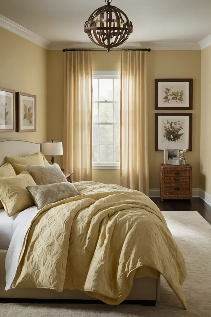
Soft butter brings gentle warmth and cheerful energy to your guest space.
This subtle yellow creates a sunny atmosphere that makes visitors feel immediately welcome and uplifted.
Choose a significantly muted butter—almost a neutral with just a hint of yellow—to ensure sophistication rather than intensity.
It pairs beautifully with crisp whites and natural textures.
This versatile color creates a different mood with different accents—country charm with blues, contemporary elegance with grays, or traditional comfort with warm woods.
16: Light Olive

Light olive brings natural sophistication to your guest retreat.
This complex green-gray hybrid creates an organic connection that helps visitors feel grounded after travel.
Unlike brighter greens that can feel themed, light olive offers subtle color that works as a sophisticated neutral.
It pairs beautifully with both cool metals and warm woods.
This chameleon-like color shifts subtly throughout the day, creating visual interest for guests spending significant time in the room.
17: Pale Blush

Pale blush creates a subtly flattering backdrop that makes your guest room feel special without being polarizing.
This sophisticated pink-neutral hybrid brings warmth without obvious color commitment.
Choose a very subtle blush—almost a warm white with just a hint of pink—to ensure broad appeal across different tastes and preferences.
It pairs beautifully with both gray and gold accents.
This universally flattering color makes everyone look their best, a thoughtful touch your guests will appreciate without necessarily identifying the reason.
18: Soft French Blue

Soft French blue brings European sophistication to your guest quarters.
This muted blue with gray undertones offers more character than typical blues while maintaining broad appeal.
The cultural associations with French country and coastal retreats create a subtle vacation feeling for your visitors.
It pairs beautifully with cream, natural linen, and warm woods.
This versatile color creates different aesthetics with different accessories—coastal with whites, traditional with antiques, or contemporary with clean-lined furniture.
19: Light Putty

Light putty creates a sophisticated neutral foundation with subtle warmth that feels both current and timeless.
This complex beige-gray hybrid offers more character than basic neutrals without limiting your decorating options.
The practical medium tone hides minor marks better than lighter shades—a thoughtful consideration for a space with changing occupants.
It pairs beautifully with virtually any accent color.
This versatile neutral works with both traditional and contemporary furnishings, allowing your guest room to evolve as your taste changes over time.
20: Misty Mint

Misty mint brings subtle freshness to your guest retreat without overwhelming color commitment.
This soft gray-green hybrid creates a spa-like atmosphere that helps travelers decompress.
Choose a very subtle mint with significant gray undertones—almost a neutral with just a hint of color—to ensure sophisticated appeal.
It pairs beautifully with crisp whites and natural elements.
This versatile color creates different effects with different accents—spa-like with whites, vintage with brass, or contemporary with chrome and glass.
21: Pale Slate

Pale slate creates a sophisticated backdrop with subtle natural associations.
This light blue-gray hybrid offers contemporary appeal without feeling cold or unwelcoming to guests.
The subtle mineral-inspired color brings an organic quality that helps ground travelers after their journey.
It pairs beautifully with both warm woods and cool metals.
This versatile neutral adapts to different lighting conditions throughout the day, creating visual interest for guests spending significant time in the room.
22: Light Camel

Light camel brings rich warmth and timeless sophistication to your guest quarters.
This warm neutral with gold undertones creates an instantly welcoming atmosphere for visitors of all tastes.
Unlike beige, which can feel bland, camel offers more character and intentionality without alienating traditionally-minded guests.
It pairs beautifully with both cool and warm accent colors.
This practical color hides minor marks better than lighter shades—an important consideration for a room with changing occupants.
23: Pale Periwinkle

Pale periwinkle brings unique yet broadly appealing color to your guest retreat.
This soft lavender-blue hybrid creates a tranquil atmosphere that helps travel-weary visitors relax and rejuvenate.
Choose a very subtle periwinkle—almost a neutral with just a hint of color—to ensure sophisticated appeal across different taste preferences.
It pairs beautifully with both silver and gold accents.
This flattering color creates a subtle glow that enhances skin tones, making your guests look and feel their best during their stay.
24: Warm Oyster

Warm oyster creates a sophisticated neutral with subtle dimension beyond basic whites and beiges.
This complex off-white with pink-gray undertones offers refinement without limiting your decorating options.
The subtle warmth prevents the clinical feeling of stark white while maintaining bright, open qualities that make spaces feel generous.
It pairs with virtually any accent color or wood tone.
This versatile neutral allows your decorative elements and guest amenities to stand out while providing an elevated backdrop that feels intentional and designed.
25: Soft Khaki

Soft khaki brings practical sophistication to your guest quarters.
This neutral with subtle green undertones offers earthy comfort that helps visitors feel grounded and welcome.
Unlike typical beige, khaki contains complexity that creates more visual interest for guests during extended stays.
It pairs beautifully with both cool and warm accent colors.
This medium-toned neutral hides minor imperfections better than lighter shades—a practical consideration for a room with variable occupants and care levels.
26: Pale Eucalyptus

Pale eucalyptus brings subtle organic freshness to your guest retreat.
This sophisticated gray-green hybrid creates a spa-like atmosphere that helps travelers decompress after their journey.
The natural associations create a subconscious connection to wellness and rejuvenation—perfect for helping guests relax.
It pairs beautifully with crisp whites and natural textures.
This versatile color works with both contemporary and traditional furnishings, allowing your guest room to evolve as your taste changes over time.
27: Cloud White

Cloud white creates bright, versatile elegance that appeals to guests of all preferences.
Unlike stark whites, cloud white contains subtle warm undertones that prevent a clinical feeling.
This classic choice reflects maximum light, making even small guest rooms feel more spacious and airy.
It pairs with absolutely any accent color, wood tone, or decorative scheme.
This timeless neutral allows your furniture and accessories to take center stage while providing a fresh, clean backdrop that guests universally associate with quality accommodations.
Conclusion
The perfect guest bedroom color welcomes visitors while reflecting your home’s personality.
Whether you choose subtle neutrals or soft color-infused options, these 27 shades will help you create a space your guests will remember fondly.