21 Stunning Neutral Living Room Ideas for a Timeless and Elegant Space
Neutral living rooms offer timeless appeal and versatility that bold color schemes simply can’t match.
These balanced spaces create perfect backdrops for your life, allowing furnishings, art, and accessories to shine without competing color distractions.
Today’s neutral palettes extend far beyond basic beige, encompassing sophisticated grays, warm taupe’s, soft whites, and natural earth tones.
These versatile foundations adapt beautifully to changing design trends and seasonal updates.
Discover these 21 neutral living room ideas that prove understated doesn’t mean boring.
From textural elements to strategic color placement, these approaches create spaces with depth, character, and enduring style.
1: Textural Layering Strategy

Create visual interest in a neutral space by combining multiple textures rather than multiple colors.
Mix rough jute rugs with smooth leather, nubby linen with sleek glass, and matte surfaces with subtle shimmer.
Position contrasting textures next to each other to highlight their differences. Add natural elements like wood, stone, or plants to enhance the textural diversity.
This layering technique transforms simple neutral palettes into rich, tactile environments with depth and sophistication.
2: Strategic Color Accents

Inject personality into your neutral foundation with carefully placed color accents.
Choose one or two complementary hues to introduce through easily changeable elements like throw pillows, vases, or art.
Repeat your accent color in at least three places for intentional distribution.
This controlled approach prevents individual colored items from appearing random or disconnected.
The neutral backdrop allows these color moments to truly shine while maintaining the room’s overall tranquil atmosphere.
3: Statement Architectural Element

Highlight one architectural feature in your neutral space through subtle contrast or special treatment.
Consider a limestone fireplace, wood-beamed ceiling, or textured accent wall as your room’s natural focal point.
Enhance the feature with strategic lighting that highlights its unique characteristics.
Keep surrounding elements visually quieter to prevent competition with your architectural star.
This approach leverages existing structural elements as design features while maintaining your neutral color discipline.
4: Tone-on-Tone Layering

Create sophisticated depth by combining multiple shades of the same neutral color family.
Layer various tones of beige, gray, or taupe throughout your upholstery, walls, and accessories.
Vary the intensity slightly between large elements like walls and sofas. The subtle shifts create visual movement without introducing contrasting colors.
This refined technique establishes a cohesive, enveloping atmosphere while avoiding the flatness of perfectly matched neutrals.
5: Natural Material Focus

Build your neutral palette around honest, natural materials that bring inherent character and subtle color variation.
Incorporate elements like unfinished wood, natural stone, linen, cotton, and jute.
Choose materials with visible texture and grain patterns. The authentic imperfections and variations create visual interest within strict color limitations.
This organic approach connects your interior to the natural world while providing timeless appeal that transcends trends.
6: Oversized Neutral Art

Anchor your space with a large-scale artwork in neutral tones.
Abstract pieces with subtle color shifts, texture, or high-contrast black and white works create dramatic focus without disrupting your palette.
Position where it will command attention—above a sofa or fireplace. Choose pieces with enough visual weight to hold their own in the room.
This artistic focal point adds personality and sophistication while maintaining the tranquil neutral environment you’ve established.
7: Varied White Exploration

Develop a nuanced all-white space by combining different white tones with varied textures.
Mix warm ivories, cool whites, and soft creams through different materials and surfaces.
Add dimensional white elements like plaster wall treatments or sculptural objects.
Incorporate natural fibers and textiles that bring textural variation within the white palette.
This refined approach creates spaces with surprising depth and interest while maintaining an airy, light-filled atmosphere.
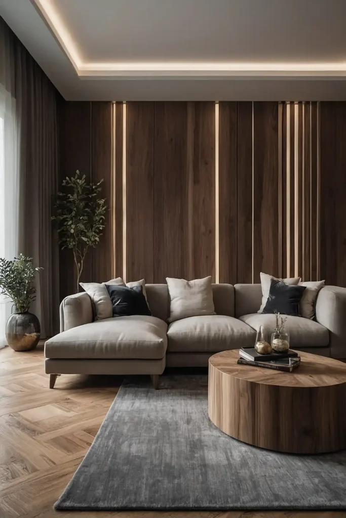
8: Curved Furniture Integration

Soften your neutral space with curved furniture forms that add visual movement and organic flow.
Round coffee tables, curved sectionals, or arched cabinets break up the linearity of typical room layouts.
Choose pieces with sculptural presence that can serve as design features. The gentle curves create natural focal points without requiring bold colors or patterns.
This shape-focused strategy adds significant visual interest while maintaining the calming properties of your neutral color scheme.
9: Minimalist Negative Space

Embrace strategic emptiness by allowing breathing room between furniture groupings and wall displays.
This intentional negative space becomes a design element itself within neutral interiors.
Resist the urge to fill every surface or corner. Position fewer, better pieces with room to appreciate each element individually.
This disciplined approach creates sophisticated, gallery-like spaces where each item receives proper visual attention and appreciation.
10: Dramatic Contrast Moments

Create visual excitement by incorporating high-contrast elements within your neutral scheme.
Consider black window frames against white walls, dark sofas with light rugs, or charcoal accents in a cream-colored room.
Limit contrast to specific moments rather than throughout the space.
This controlled approach creates focal points without disrupting the overall neutral harmony.
The strategic tension between light and dark elements adds energy and definition while still qualifying as a neutral design approach.
11: Subtle Pattern Introduction

Incorporate visual texture through patterns that stay within your neutral color family.
Consider tone-on-tone stripes, geometric weaves, or natural motifs that add interest without introducing new colors.
Limit patterns to specific elements like rugs, pillows, or occasional chairs. Balance patterned pieces with solid counterparts to maintain visual calm.
This restrained approach adds depth and sophistication while preserving the serene, uncluttered aesthetic of neutral spaces.
12: Monochromatic Wood Tones
Create a cohesive neutral palette by coordinating wood tones throughout your furniture pieces.
Either match woods precisely for a curated look or choose a tight range of related hues.
Consider bleached woods for lighter neutral schemes or richer walnut tones for warmer spaces.
The natural variation within wood grain provides subtle interest within your controlled palette.
This material-focused approach adds natural warmth while maintaining the sophisticated restraint of neutral design.
13: Sculptural Lighting Features

Install statement lighting fixtures that function as artistic focal points within your neutral room.
Choose pieces with interesting forms, natural materials, or architectural presence.
Position to create pools of light that highlight textural elements. Select fixtures that make visual statements even when not illuminated.
This strategic approach adds personality and sculptural interest while working within neutral color parameters.
14: Plush Textile Layers

Create inviting comfort with abundant soft textiles in your neutral space.
Layer luxurious throws, overstuffed pillows, and soft rugs to add approachable warmth and tactile appeal.
Choose varied textures within your neutral palette—chunky knits, soft bouclés, smooth velvets.
The dimensional softness transforms simple color schemes into inviting retreats.
This comfort-focused strategy ensures neutral rooms feel welcoming rather than sterile or austere.
15: Reflective Surface Integration

Incorporate materials that play with light—mirrors, glass, polished metals, or lacquered surfaces—to add dimension to neutral spaces.
These reflective elements create movement and luminosity without color.
Position to amplify natural light sources for maximum effect. Mix reflective surfaces with matte finishes for balanced contrast.
This light-enhancing approach creates visual dynamism even within the most limited color palettes.
16: Earth Tone Foundation

Build your neutral scheme around nature-inspired earth tones like taupe, sand, camel, and warm gray.
These grounded hues create rich, inviting spaces that connect to the natural world.
Layer various earthy neutrals rather than using a single shade throughout. This diversity creates a natural, evolved feeling rather than a showroom aesthetic.
This organic approach feels both timeless and contemporary while providing a versatile foundation for various decorative styles.
17: Artisanal Accent Integration

Incorporate handcrafted elements like pottery, handwoven textiles, or carved wooden objects to add soul and character to neutral rooms.
These unique pieces bring authenticity and tactile interest.
Position these special items where they receive proper focus. Choose pieces with subtle color variations that enhance rather than disrupt your neutral palette.
This curated approach prevents neutral spaces from feeling mass-produced while adding meaningful layers of craftsmanship and culture.
18: Architectural Trim Enhancement

Define your neutral space with architectural details like crown molding, wainscoting, coffered ceilings, or built-in shelving.
These structural elements add dimension without requiring color contrast.
Paint trim the same color as walls for subtle sophistication or slightly lighter/darker for gentle definition. The shadows created by these details add natural depth.
This architectural strategy adds timeless character while maintaining the clean, cohesive look of neutral design.
19: Varied Neutral Pattern Mix

Create rich visual texture by combining multiple patterns that share your neutral color palette.
Mix small-scale geometrics with organic motifs, stripes with subtle florals, or classic herringbones with contemporary abstracts.
Vary the scale of patterns—combine larger motifs with smaller, more intricate designs.
Distribute patterned elements throughout the space for balanced distribution.
This designer technique creates dynamic interiors while maintaining the soothing qualities of your neutral color foundation.
20: Green Element Integration

Incorporate plants as your primary “color” accent within strictly neutral surroundings.
The natural green functions as a neutral companion while adding life and organic energy.
Choose varieties with interesting shapes and textures—from sculptural fiddle leaf figs to cascading trailing vines.
Position at varying heights to create visual movement throughout the space.
This biophilic approach connects interior spaces to nature while maintaining a disciplined neutral palette that feels both fresh and timeless.
21: Historical Neutral Inspiration

Draw from specific design periods known for neutral sophistication—Belgian minimalism, Swedish Gust avian, Japanese wabi-sabi, or California organic modernism.
These established aesthetics provide cohesive frameworks for neutral execution.
Study the specific neutral tones associated with your chosen style tradition. Incorporate authentic materials and forms typical of that design language.
This historically grounded approach lends depth and intention to your neutral choices while creating spaces with specific character rather than generic blandness.
Conclusion
Start with quality foundation pieces in your preferred neutral shades, then build texture and interest through thoughtful layers.
Remember that successful neutral rooms balance restraint with warmth through materiality, contrast, and purposeful design decisions.